Loading ...
Loading ...
Loading ...
64
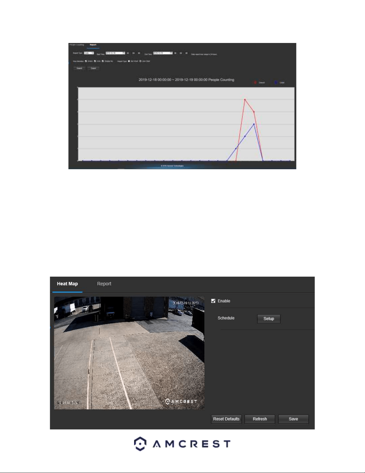
The date and time range will be displayed on the top of the chart as well as a color-coded display and legend of the
enters and exit statistics will be displayed as well. The left side of the chart will display the range of people that
were reported. The blue line represents the amount of exits in the chart and the red line represents the amount of
people who entered.
Heat Map
The Heat Map function provides a general reporting of crowd density statistics based on color levels detected by
the camera. Color levels are divided into, red, orange, yellow, green, and blue which represent crowd density
ranges; red being the densest area and blue representing areas with the lowest density.
Below is a screenshot of the Heat Map menu:
Loading ...
Loading ...
Loading ...