ControlSpace
®
Remote Builder 2.3 User's Guide
TOC
Introduction 4
Product Overview 4
Bose ControlSpace Remote builder software 4
Bose ControlSpace Remote app 5
To get started 5
Remote Builder Window 6
Menus 6
File Menu 6
Edit Menu 7
Layout Menu 7
Tools Menu 8
Help Menu 8
Toolbar 8
Project/Properties Panel 9
Control Panel Canvas 9
Canvas Setup Properties 9
Layout Tool 10
File Types 11
Creating Panels Using Templates 12
Creating Control Panels 12
Sending to a Mobile Device 24
Creating Custom Panels 27
Creating Custom Layouts 27
Importing Backgrounds 27
Adding images 30
Adding Text Frames &Labels 32
Adding Frames 34
Adding Regions 36
Creating Custom Controls 38
Custom Buttons 39
Custom Sliders 40
Custom Drop Lists 42
Custom RCGroups 44
Room Combination Actions 44
Room Combination Audio Controls 49
Custom Parameter Sets 50
Custom Parameter Set Lists 52
Custom Links 54
Custom Setup Button 56
- 1 -
ControlSpace
®
Remote Builder 2.1
User's Guide
ControlSpace
®
Remote Builder 2.3 User's Guide
Introduction
Product Overview
Bose ControlSpace Remote builder software
Bose ControlSpace Remote builder software is a graphical user interface tool used to design, test and
deploy mobile control panels for the Bose ControlSpace Remote app.
Bose ControlSpace Remote builder is used by system integrators to configure control panels that are sent
to the ControlSpace Remote app. Using control panel templates from within ControlSpace Remote builder,
integrators are able to quickly create unique interfaces for wireless control of Bose networked pro audio
systems.
System designs created in ControlSpace Designer™ software are easily imported into ControlSpace
Remote builder. Defined system control elements such as volume, mute, source selection, tone EQ, and
parameter sets are assigned to end-user friendly templates. Multiple app designs – each personalized for a
specific user’s control needs – can be created and tested from ControlSpace Remote builder and sent wire-
lessly to mobile devices on the network.
You can create control panels either using the built-in templates, or using the graphical elements available
in the layout mode to design customized layouts and control buttons.
For designing with templates, see Creating Control Panels.
For designing customized panels, see Creating Custom Layouts and Creating Custom Controls.
- 4 -
ControlSpace
®
Remote Builder 2.3 User's Guide
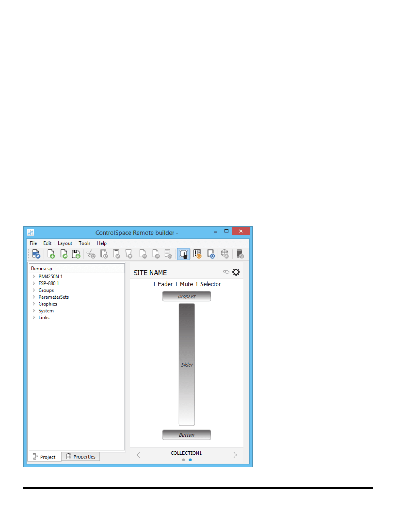
ControlSpace Remote Builder Window Example
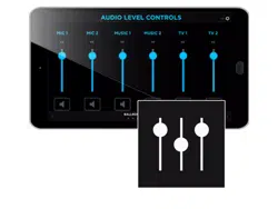
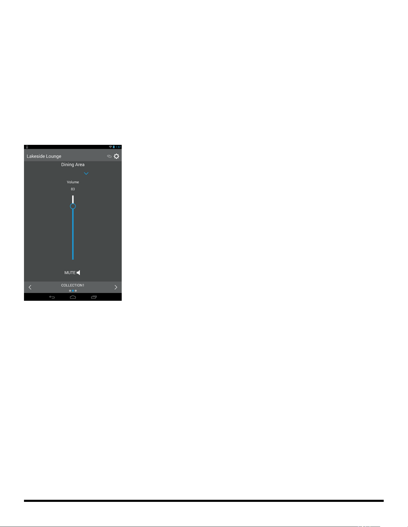
Bose ControlSpace Remote app
Bose ControlSpace Remote app is a mobile device application for Android™ and iOS devices that
provides wireless control of networked Bose Professional system components. Personalized for each end
user’s mobile device, various functions of the system can be adjusted:
• Volume levels and mute state
• Source selection
• Tone EQ settings
• Parameter set recall
ControlSpace Remote app is available as a free download on the App Store or Google Play™ store.
ControlSpace Remote App Control Panel Example
To get started
1. From pro.Bose.com, download and install the ControlSpace Remote builder desktop app to your com-
puter.
2. From the Google Play™ or App Store, download and install the ControlSpace Remote app to your
mobile device.
3. Ensure that your Android™ or iOS device is connected to the same Wi-Fi® network as your Con-
trolSpace/PowerMatch devices.
Android and Google Play are trademarks of Google Inc.
App Store is a service mark of Apple Inc.
Wi-Fi is a registered mark of the Wi-Fi Alliance.
- 5 -
ControlSpace
®
Remote Builder 2.3 User's Guide
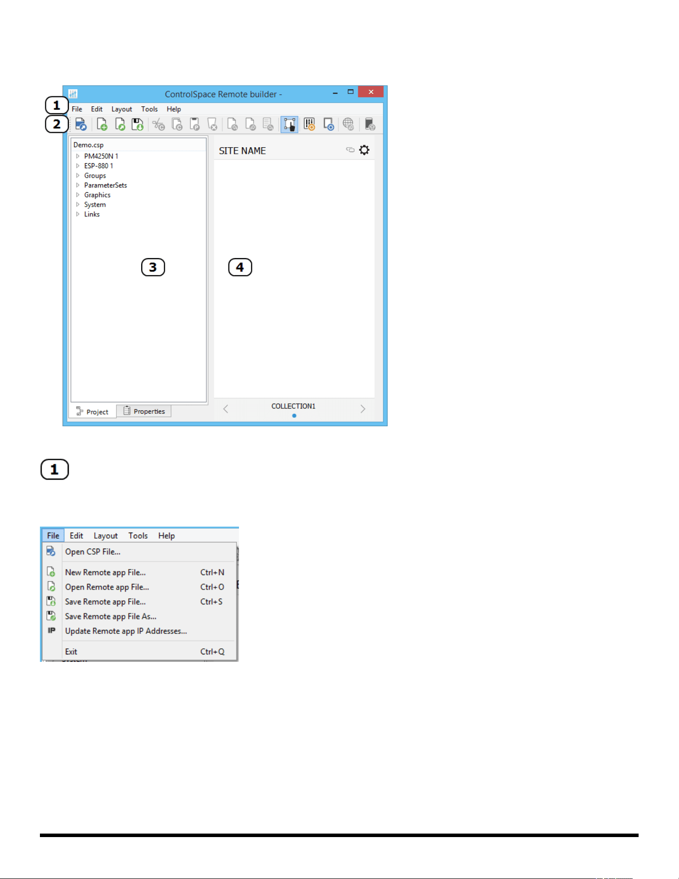
Remote Builder Window
Remote builder window elements
Menus
File Menu
Open CSP file… opens a window for browsing to an existing ControlSpace® Designer™ software project file.
New Remote app File… opens a window in which you can select a template or blank panel to use for build-
ing a new Remote app control panel.
Open Remote app File… opens a window for browsing to an existing Remote app file.
Save Remote app File… initially opens a window for naming the current Remote app file and browsing to a
location to save it. Subsequent selections of this menu option will immediately save changes directly to
the previously selected file location.
Save Remote app File As… opens a window for renaming current Remote app file and browsing to a loc-
ation to save it.
- 6 -
ControlSpace
®
Remote Builder 2.3 User's Guide
Update Remove app IP Addresses... opens a window for updating the IP addresses of each device in the
open project file.
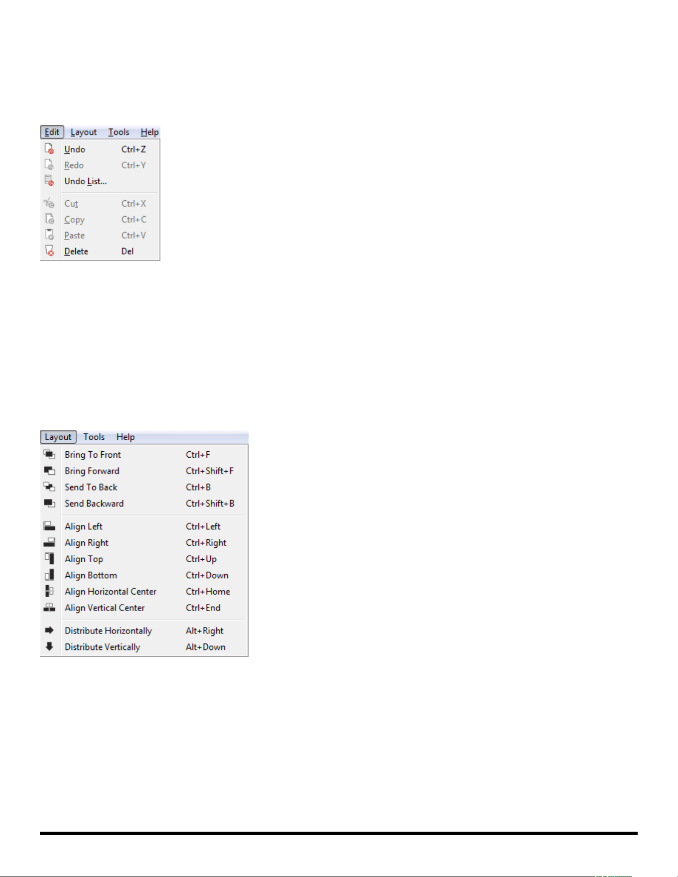
Edit Menu
Undo… erases the last change and reverts to the previous state.
Redo… reverts the effects of the undo action.
Undo List… opens the Undo/Redo window
Cut… removes the selected item and copies it to the clipboard (standard Windows editing function).
Copy… copies the selected item to the clipboard (standard Windows editing function).
Paste… pastes the contents of the clipboard (standard Windows editing function).
Delete… removes the selected item.
Layout Menu
Bring to Front… moves the selected object to the top layer.
Bring Forward… moves the selected object one layer toward the top.
Send to Back… moves the selected object to the bottom layer.
Send Backward… moves the selected object one layer toward the bottom.
Align Left… aligns selected objects relative to their left edges.
Align Right… aligns selected objects relative to their right edges.
Align Top… aligns selected objects relative to their top edges.
Align Bottom… aligns selected objects relative to their bottom edges.
- 7 -
ControlSpace
®
Remote Builder 2.3 User's Guide
Align Horizontal Center… aligns selected objects relative to their horizontal centers.
Align Vertical Center… aligns selected objects relative to their vertical centers.
Distribute Horizontally… distributes selected objects evenly along the horizontal axis
Distribute Vertically… distributes selected objects evenly along the vertical axis
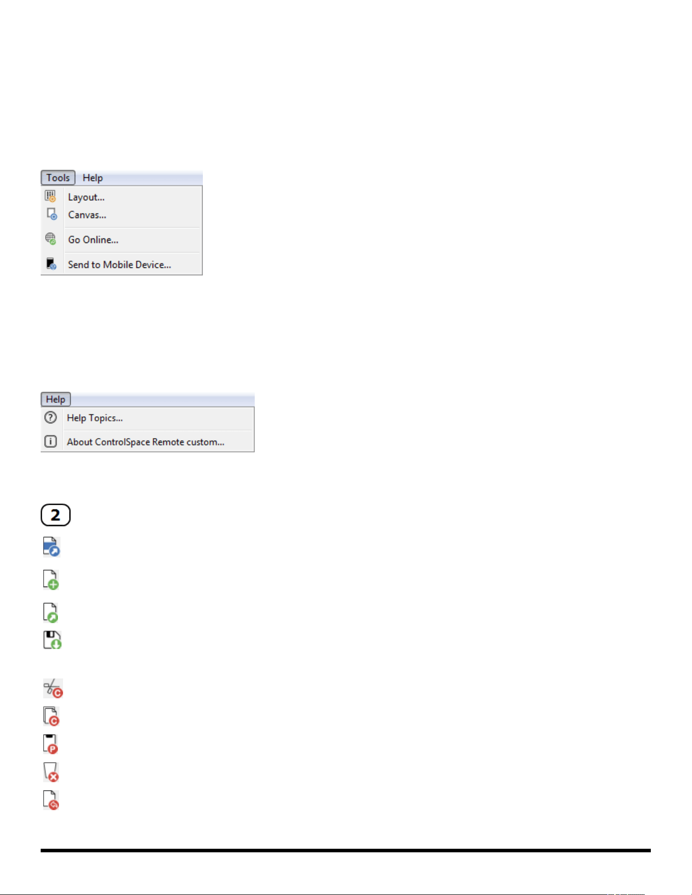
Tools Menu
Layout… opens the Layout dialog which allows you to add/delete collections and panels.
Canvas… opens the canvas setup dialog.
Go Online… connects to a ControlSpace network.
Send to Mobile Device… transmits the control panel file to a mobile device.
Help Menu
Help Topics… Opens online Help.
About ControlSpace Remote builder… opens a dialog which reveals the software version number.
Toolbar
Open CSP file - Opens a window for browsing to an existing ControlSpace® Designer™ software pro-
ject file
New Remote app file - Opens a window in which you can select a template or blank panel to use for
building a new Remote app control panel
Open Remote app file - Opens a window for browsing to an existing Remote app file
Save Remote app file - Initially opens a window for naming the current Remote app file and browsing
to a location to save it. Subsequent selections of this tool will immediately save changes directly to
the previously selected file location
Cut
Copy
Paste
Delete
Undo
- 8 -
ControlSpace
®
Remote Builder 2.3 User's Guide
Redo
Opens Undo list window
Enables/disables Edit mode
Opens Layout Tool
Opens Canvas Setup Properties
Go Online
Sends file to mobile device
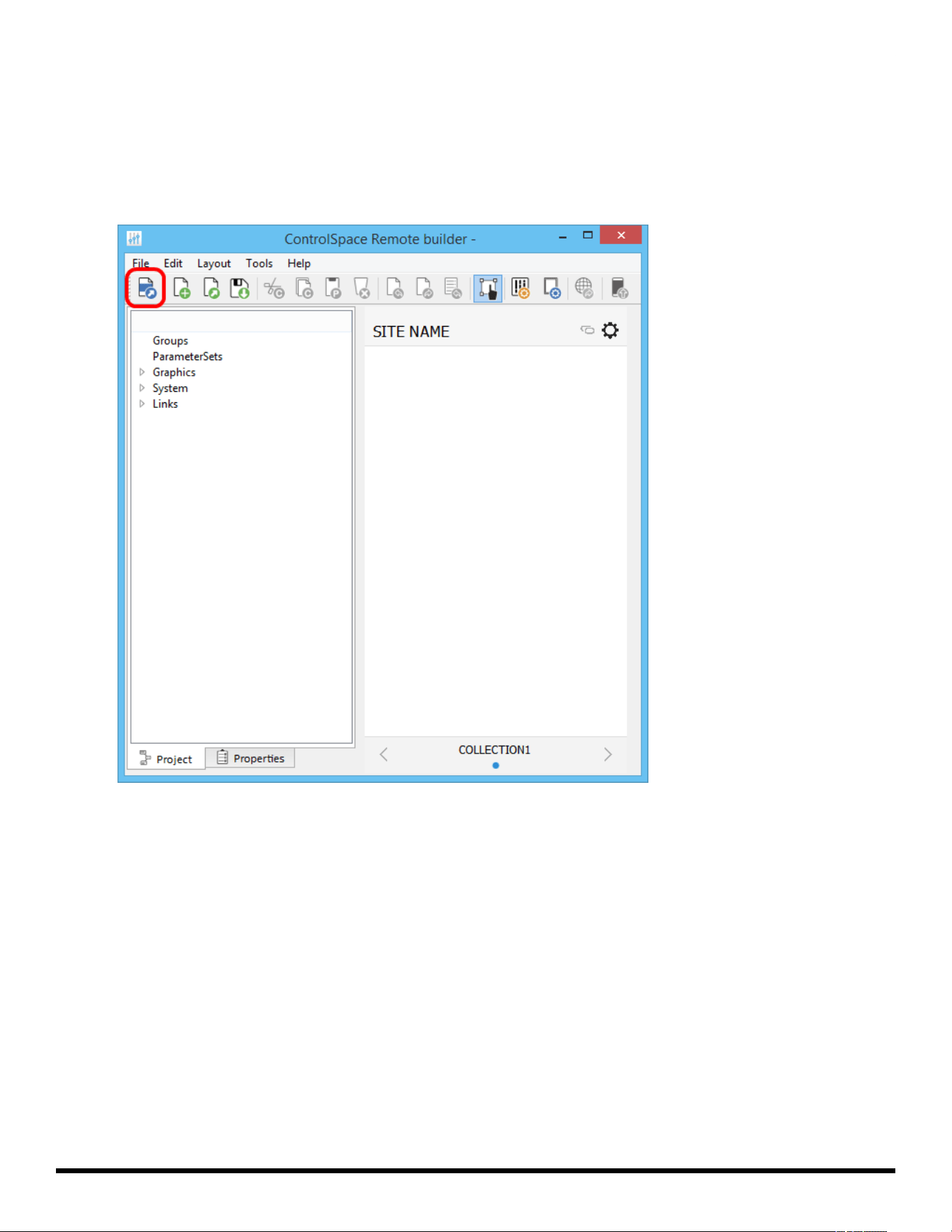
Project/Properties Panel
Selecting the Project tab displays a tree view of devices and controls in the opened project file. Selecting
the Properties tab displays properties for a selected object on the canvas.
Control Panel Canvas
This canvas is the workspace for creating control panels. The size, shape, orientation, and other properties
of the Canvas is set using the Canvas Setup properties tool in the toolbar.
See Canvas Setup Properties for more details.
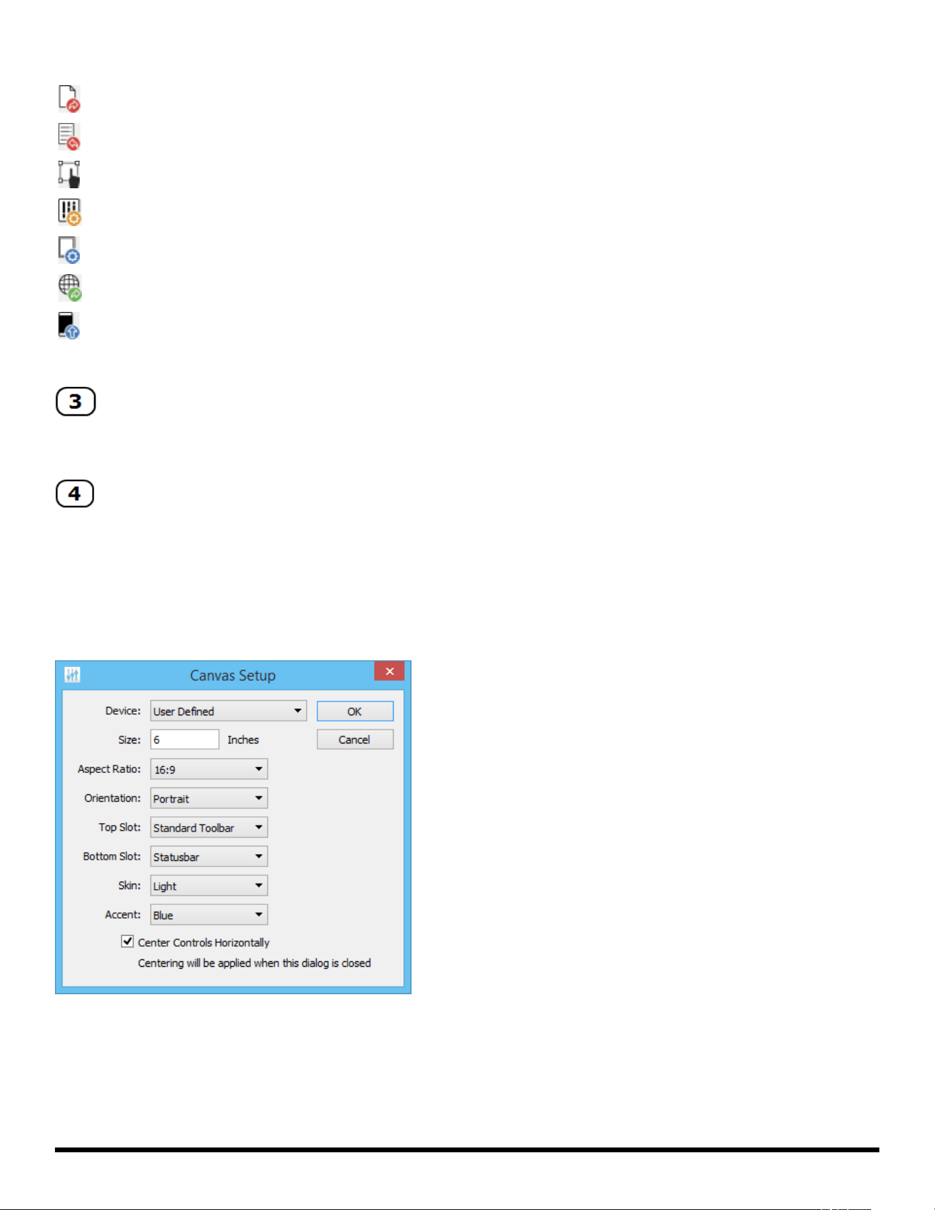
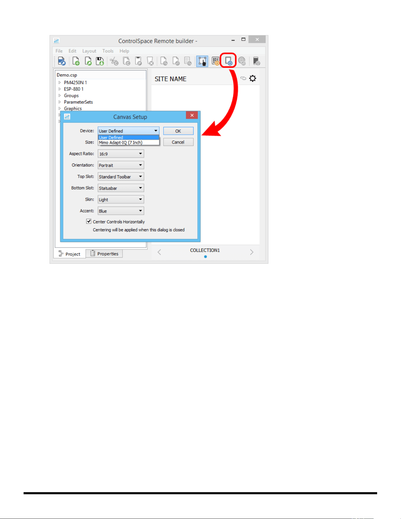
Canvas Setup Properties
The Canvas Setup window allows you to define the size and features of the control panel you are creating.
The Canvas Setup includes the following properties:
Device – Determines the canvas Size and Aspect Ratio for the selected device.
NOTE: Size and Aspect Ratio can only be adjusted manually when "User Defined" is selected as the
device.
Size – Diagonal screen dimension of the selected device.
- 9 -
ControlSpace
®
Remote Builder 2.3 User's Guide
Aspect Ratio – The proportional relationship between the width and height of the screen on the selected
device.
Orientation – Changes the orientation of the screen between portrait and landscape.
Top Slot/Bottom Slot – Places the Standard Toolbar, Minimum Toolbar, Statusbar, or no toolbar (None) in
the top/bottom border of the Canvas.
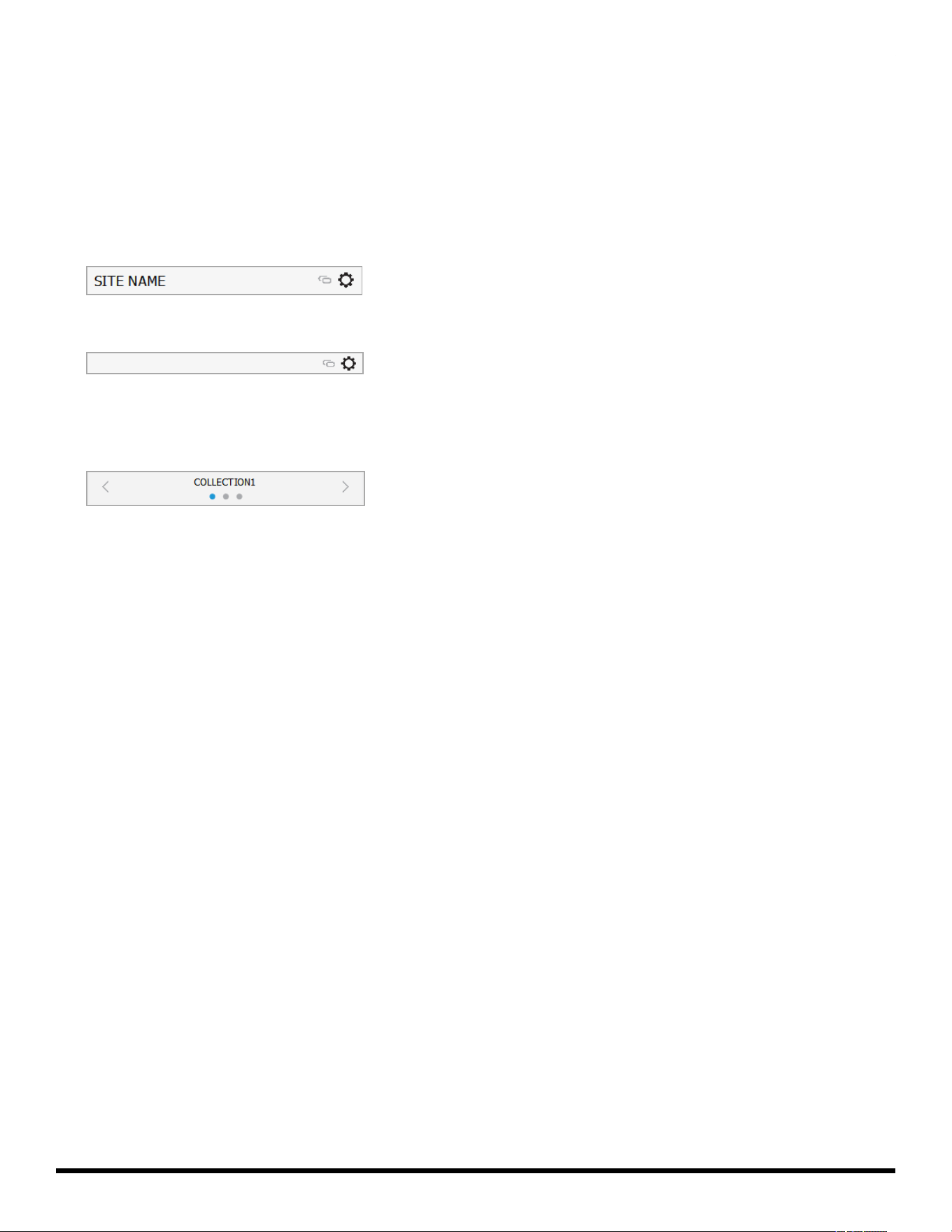
Standard Toolbar: The left-hand end of the toolbar has a field for naming the site where the panel will
be used. The SITE NAMEis entered using the Layout setup window. The right-hand end of the toolbar
includes an Online/Offline link indicator and a setup information button.
Minimum Toolbar: The Minimum Toolbar only has the Online/Offline link indicator and the setup
information button.
Statusbar: The Statusbar indicates which collection of panels has been selected. The dots indicate how
many panels are in the collection (there is always one blank panel). Click the left/right arrows to view
other panels – the highlighted dot will move left/right accordingly. Click on "COLLECTION" to open a
list of panel collections and select a different one.
Skin – Selects a Light or Dark Skin for the panel.
Accent – Selects an accent color (Black, Blue, Green, Pink, Red, or Yellow) for the controls dragged into
the panel.
Center Controls Horizontally – When checked, centers controls in the workspace. Applies only when cre-
ating custom control panels.
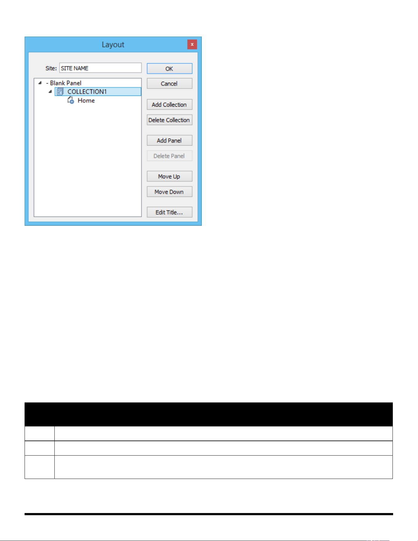
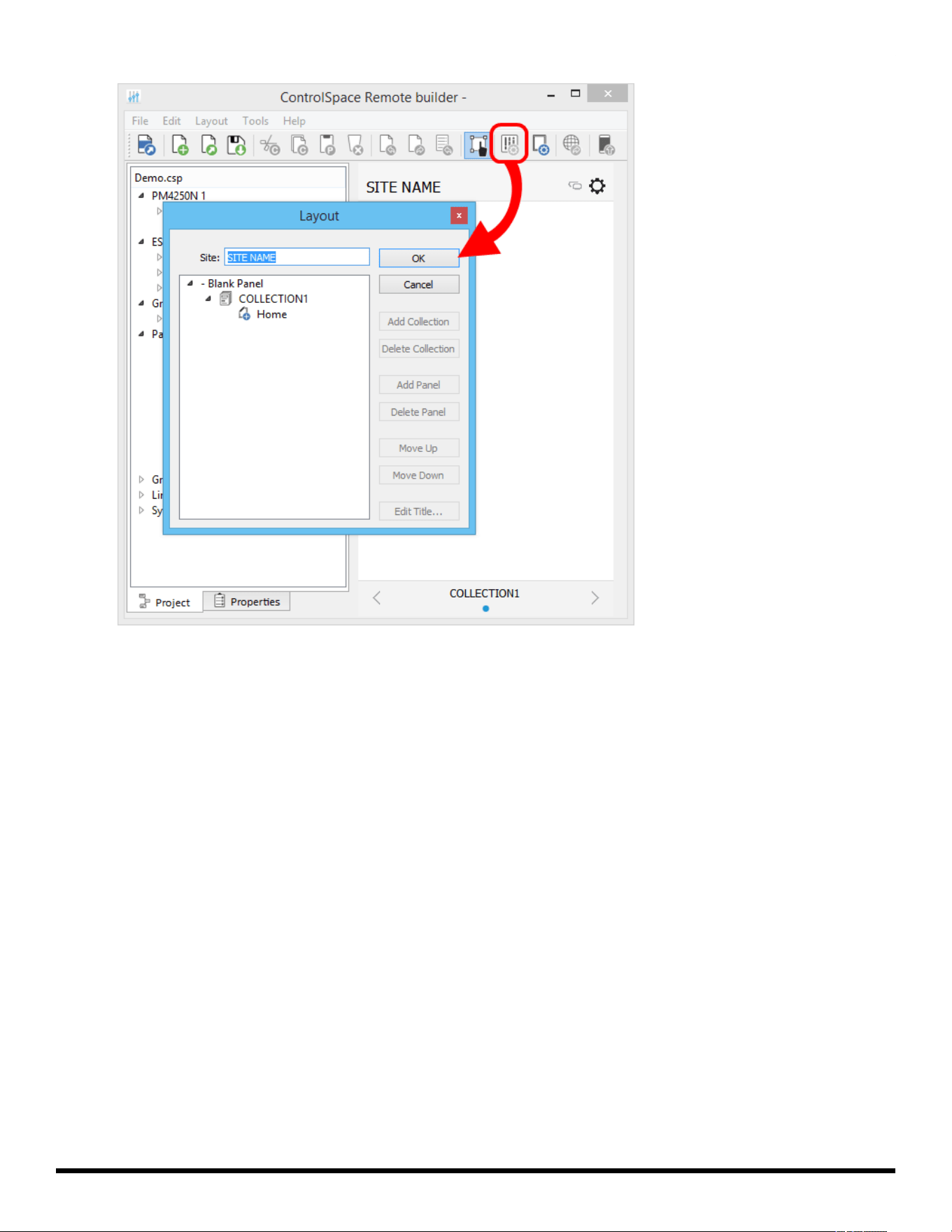
Layout Tool
The Layout tool manages the collections and control panels being created in ControlSpace® Remote
builder software. Initially, the Layout tool always provides one collection (COLLECTION1) with one blank
panel (Home). For creating custom layouts you can add additional blank panels from the template list.
- 10 -
ControlSpace
®
Remote Builder 2.3 User's Guide
Initial Layout tool content
The Layout tool provides the following control buttons:
OK – Stores changes made and closes the tool.
Cancel – Closes the tool without making any changes.
Add Collection – Adds another collection to the list.
Delete Collection – Removes the selected collection from the list.
Add Panel – Adds another control panel to the list
Delete Panel – Removes the selected control panel from the list
Move Up – Moves the selected item up one line in the list.
Move Down – Moves the selected item down one line in the list.
Edit Title – Allows changing the title of the selected collection or control panel.
File Types
This application is compatible with the following file types.
File
Type Description
.csp ControlSpace Designer project file.
.cpf Custom control panel file.
.cpz A packaged file that includes data from a control panel file (.cpf) and its associated Con-
trolSpace Designer project file (.csp).
- 11 -
ControlSpace
®
Remote Builder 2.3 User's Guide
Creating Panels Using Templates
Creating Control Panels
1. Open the Remote builder app on your computer using the desktop icon.
2. In the Remote builder Window, click the Open CSP File tool.
Open CSP File tool
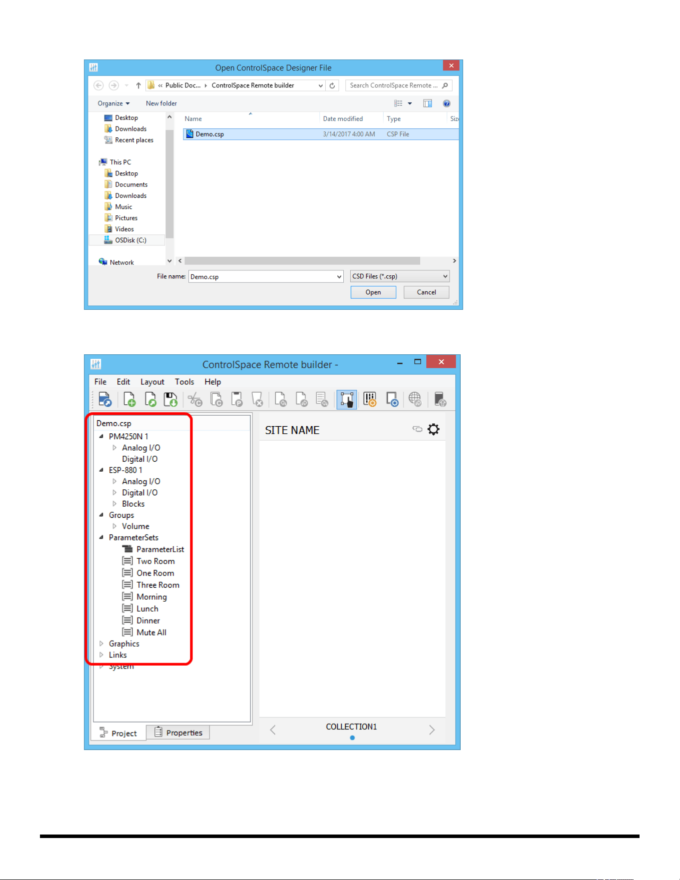
3. From the dialog window, select the ControlSpace Designer project file you created and click Open.
- 12 -
ControlSpace
®
Remote Builder 2.3 User's Guide
Selecting a Project File
4. Check that all the devices and controls in that project are listed in the window.
Project File Devices and Controls
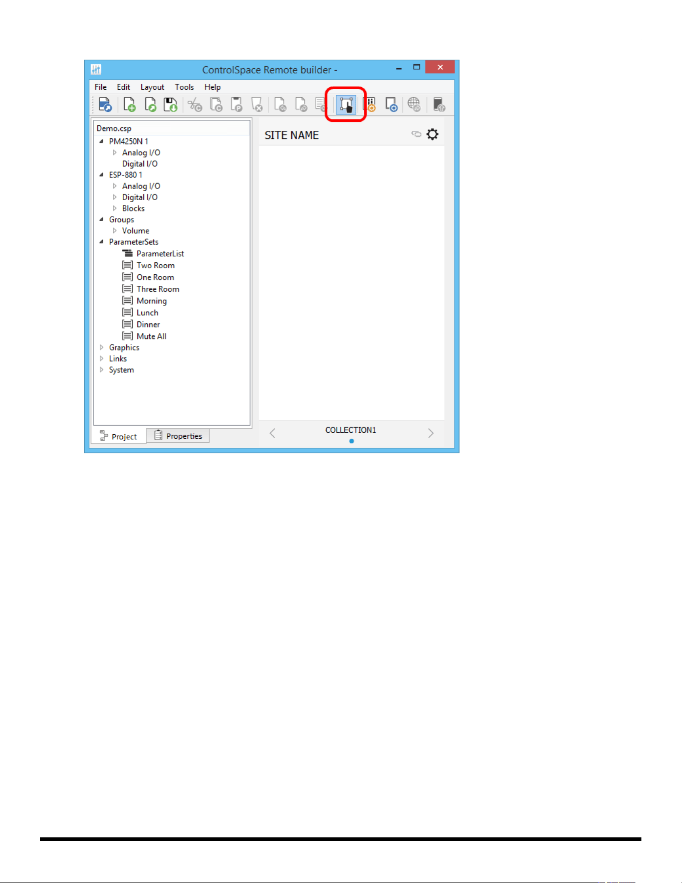
5. Before you start creating a control panel, make sure the Edit mode is selected.
NOTE: The Edit mode must be enabled in order to create a control panel.
- 13 -
ControlSpace
®
Remote Builder 2.3 User's Guide
Selecting canvas size for your device
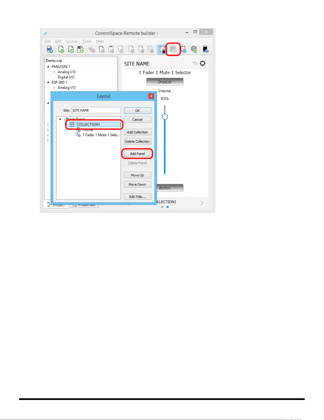
7. In the toolbar, click the Layout tool.
- 15 -
ControlSpace
®
Remote Builder 2.3 User's Guide
Clicking the Layout tool
8. Using the Layout window, add a template to the workspace. For example, click Home below
COLLECTION1. Click Add Panel, select a template and click OK.
- 16 -
ControlSpace
®
Remote Builder 2.3 User's Guide
Selecting a control panel template
- 17 -
ControlSpace
®
Remote Builder 2.3 User's Guide
Placing the template in the workspace
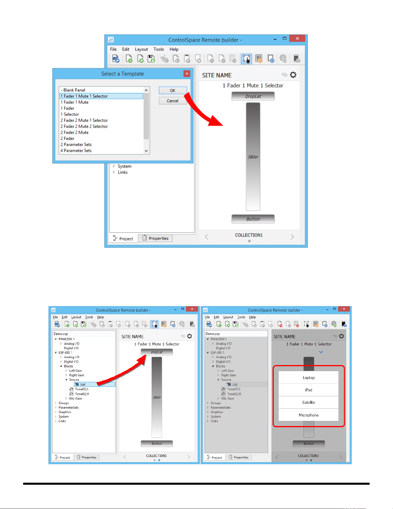
9. Drag controls to the pre-defined locations on the control panel template. See the following examples.
NOTE: To verify the operation of any control panel feature such as a slider or drop list, be sure to
disable the Edit mode.
- 18 -
ControlSpace
®
Remote Builder 2.3 User's Guide
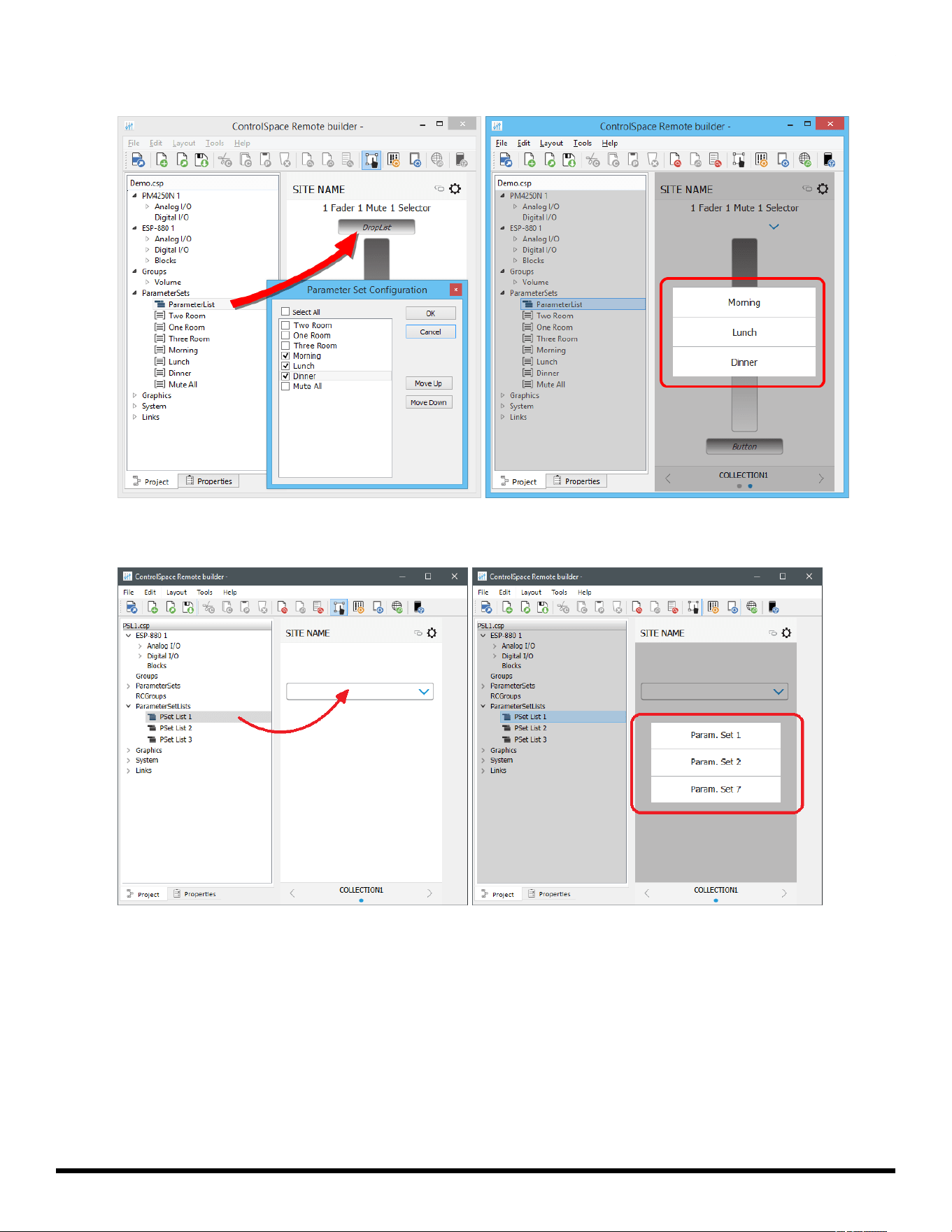
Dragging a Source list to the Drop List
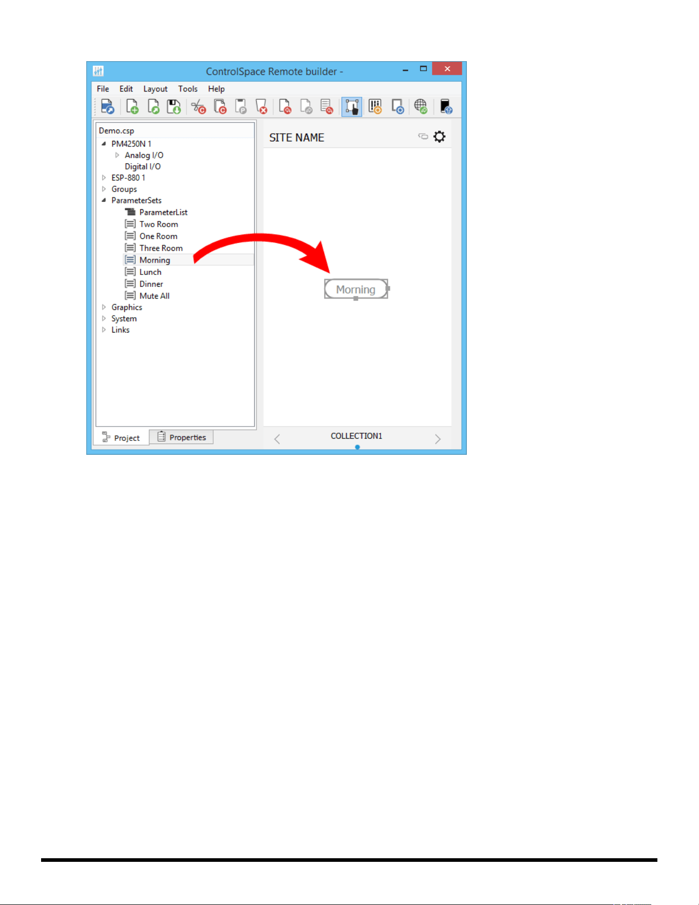
Dragging a list of Parameter Sets to the Drop List
Dragging a Parameter Set List to the Drop List
- 19 -
ControlSpace
®
Remote Builder 2.3 User's Guide
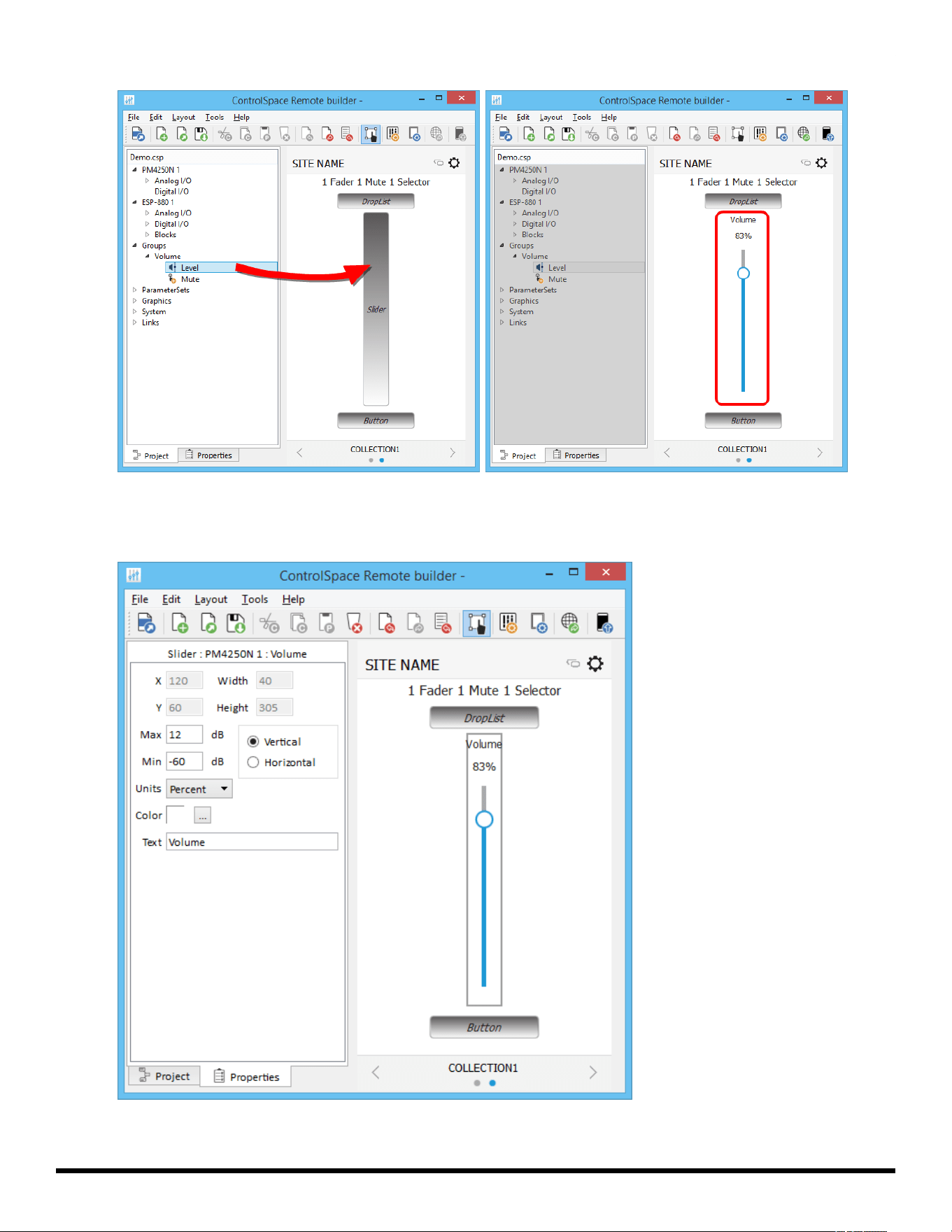
Dragging the group volume gain to the slider
To change volume limits on a slider, select the slider and click the properties tab. In this pane you
can set the maximum and minimum limits and select Percent or dB for units.
Volume Properties
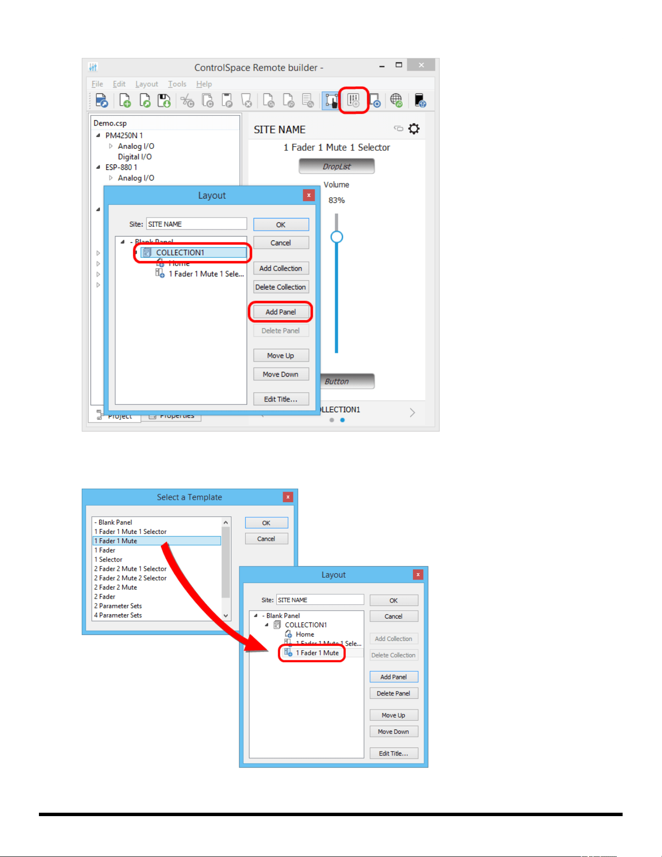
10. To add another panel, click the Layout button, select COLLECTION1 and click Add Panel.
- 20 -
ControlSpace
®
Remote Builder 2.3 User's Guide
Locating the Add Panel button
11. Select a panel template and click OK. Repeat this to add as many panels as needed. Click the left and
right arrows in the Status bar to scroll through the panels.
Adding another panel template to the Layout
- 21 -
ControlSpace
®
Remote Builder 2.3 User's Guide
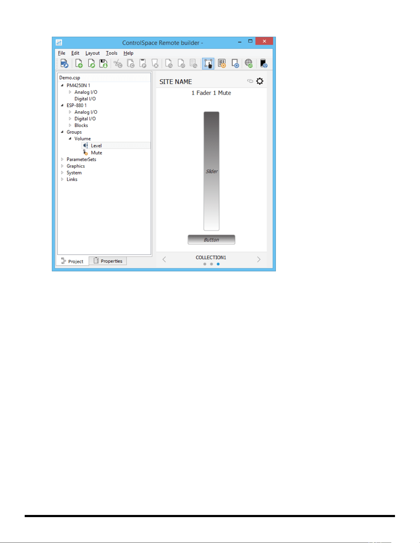
COLLECTION1 with one blank panel and two templates
NOTE: To change the COLLECTION Name, select COLLECTION1 and click Edit Title. Enter the new
name and click OK.
- 22 -
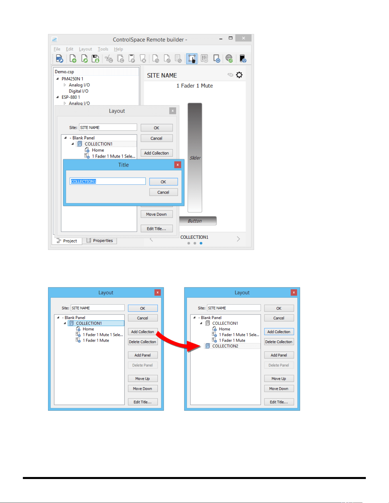
ControlSpace
®
Remote Builder 2.3 User's Guide
Changing Name of COLLECTION1.
12. To add another collection, select COLLECTION1 again and click Add Collection. COLLECTION2 is
added to the Layout.
13. To create more panels, add more templates or blank panels and drag-and-drop controls to them.
14. When you are done, click Save Remote app File.
- 23 -
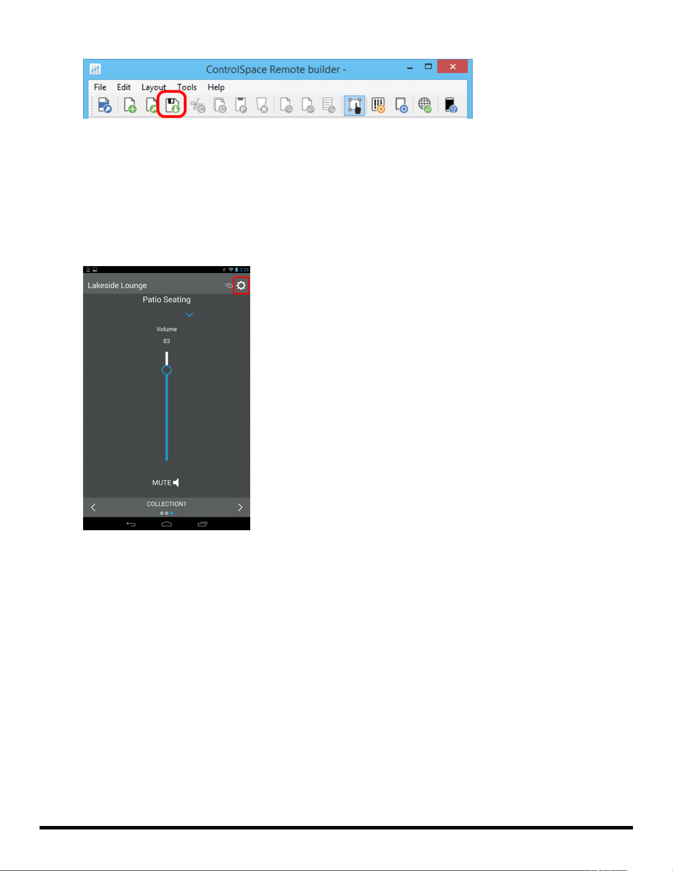
ControlSpace
®
Remote Builder 2.3 User's Guide
Save Remote app File button
Sending to a Mobile Device
To send a panel to your mobile device, make sure your PC and mobile device are connected to the same
Wi-Fi® router.
1. Launch the Remote app on your mobile device.
2. Touch the Settings icon.
Remote App Settings icon
3. In the pop-up menu, touch Receive.
- 24 -
ControlSpace
®
Remote Builder 2.3 User's Guide
Selecting Receive in the Remote app
The Receive Control Panel dialog appears and reveals the IP address used in Step 5.
Receive Control Panel Dialog
4. On your computer in the Remote builder window toolbar, click the Send to Mobile Device icon.
- 25 -
ControlSpace
®
Remote Builder 2.3 User's Guide
5. In the Send to Mobile Device dialog box, enter the IP address shown in the Receive Control Panel dia-
log on the mobile device and click OK.
The control panel file will be transferred to the mobile device.
- 26 -
ControlSpace
®
Remote Builder 2.3 User's Guide
Creating Custom Panels
Creating Custom Layouts
Using the tools and options available in ControlSpace Remote builder you can create your own cus-
tomized control panels. From the Project tab you can combine labels, images, frames, and regions to cre-
ate a customized layout. The Layout menu functions can help you position the objects you placed on the
canvas.
Learn about the following customizations below:
Importing Backgrounds
Adding Images
Adding Text Frames &Labels
Adding Frames
Adding Regions
Locating Graphics
Importing Backgrounds
Placing map, floor plan, or other graphic of a venue in the workspace.
To place a floor plan or map on the canvas:
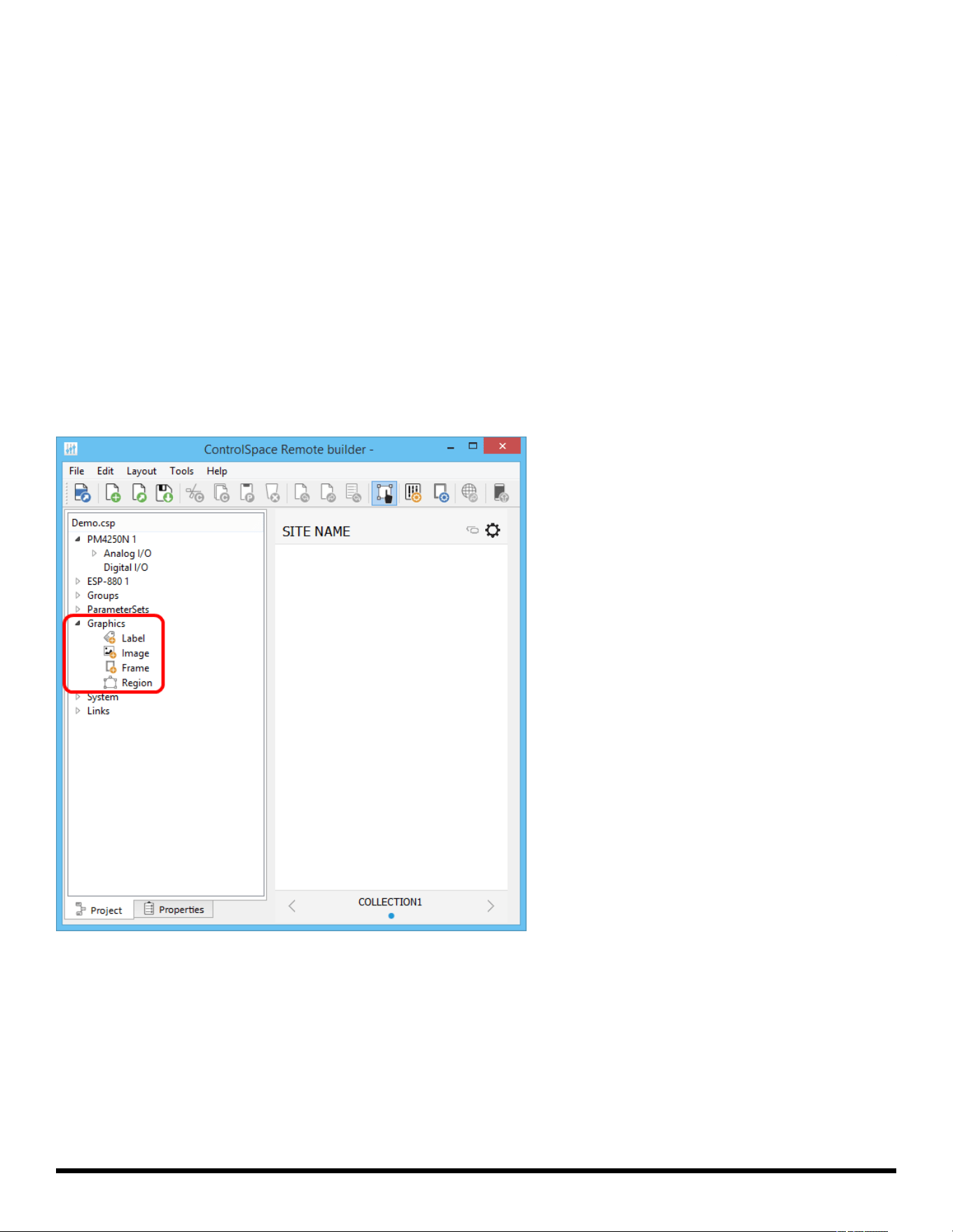
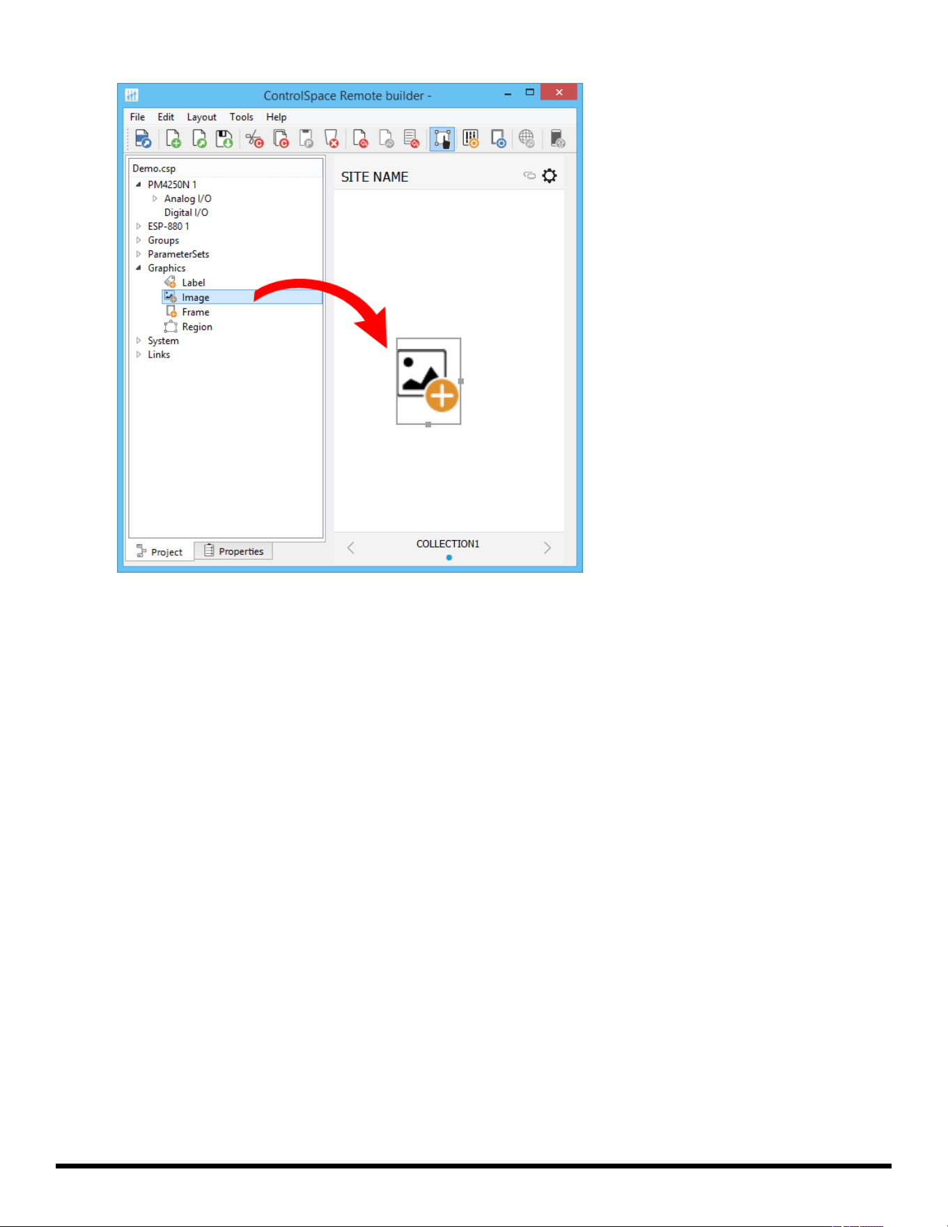
1. In the Project tab, expand the Graphics group.
2. Drag the Image icon into the canvas.
- 27 -
ControlSpace
®
Remote Builder 2.3 User's Guide
Dragging Image icon into the Canvas
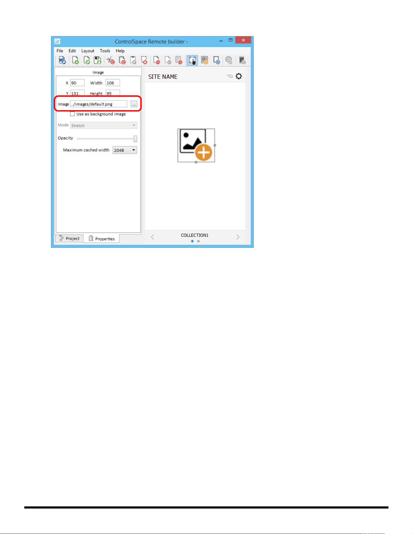
3. In the canvas, double click the Image icon. The Properties tab will automatically be selected.
4. In the Properties tab, navigate to the file you want to import from your computer and click Open. The
file will appear on the canvas.
- 28 -
ControlSpace
®
Remote Builder 2.3 User's Guide
Searching for an Image
5. Re-size the image by dragging the handles on the right side and bottom of the image frame. Altern-
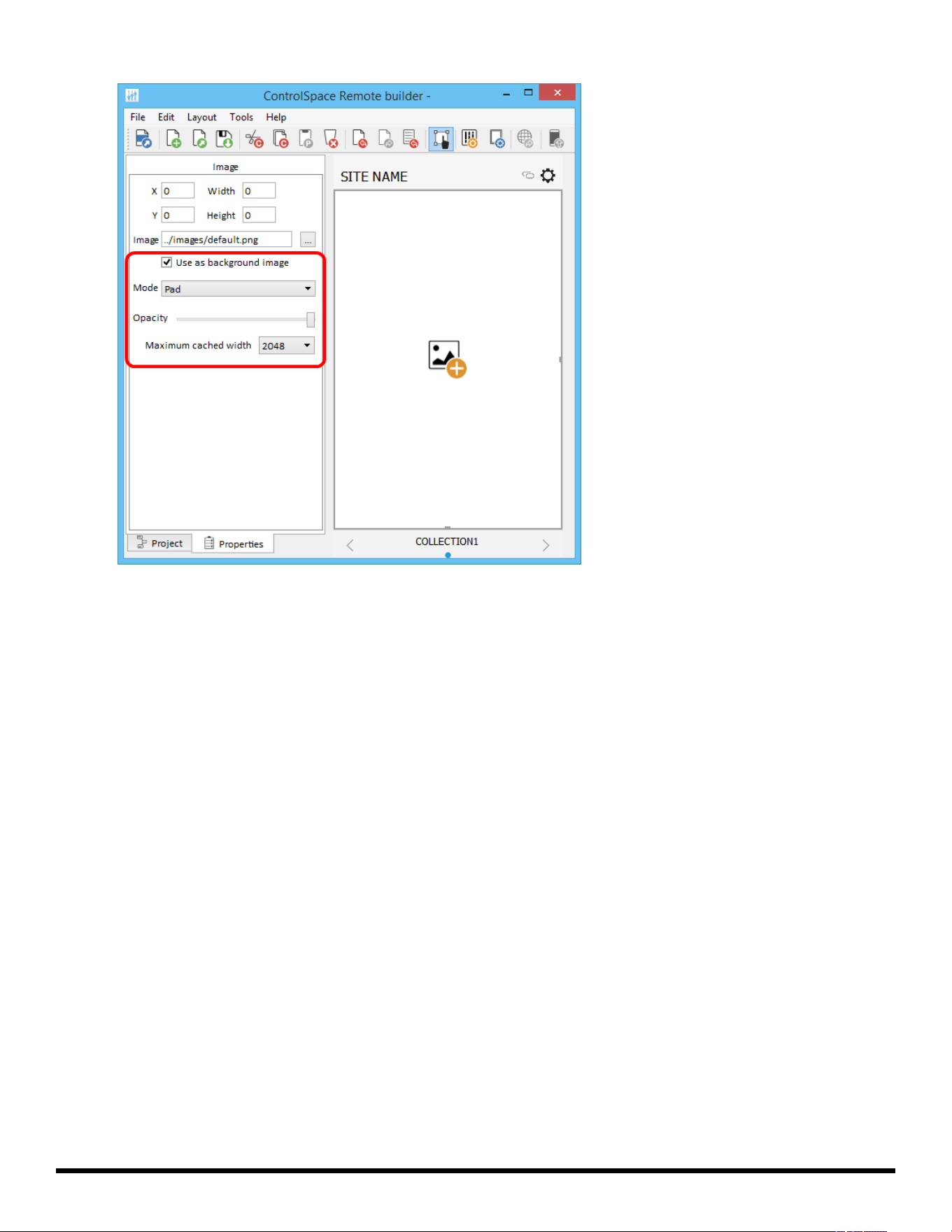
atively, set the image as a background image by clicking "Use as background image" and adjusting the
available parameters.
- 29 -
ControlSpace
®
Remote Builder 2.3 User's Guide
Mode - Specify how to adjust the background image size with respect to the canvas. Options
include:
Stretch: Fits the width and height of the image to match the canvas size. This option does not
preserve the aspect ratio of the original image.
Preserve aspect and fit: Fits the larger image dimension to the canvas size, while preserving
the aspect ratio of the original image.
Preserve aspect and crop: Fits the smaller image dimension to the canvas size, while pre-
serving the aspect ratio of the original image.
Tile: Repeats the image horizontally and vertically to fill the canvas. This option preserves the
size and aspect ratio of the original image.
Tile Horizontally: Fits the image height to the canvas size, then repeats the image horizontally
to fill the canvas. This option does not preserve the aspect ration of the original image.
Tile Vertically: Fits the image width to the canvas size, then repeats the image vertically to fill
the canvas. This option does not preserve the aspect ratio of the original image.
Pad: Centers the image on the canvas. This option preserves the aspect ratio of the original
image.
Opacity - Use the slider to adjust the opacity of the background image.
Maximum cached width - Set the maximum cache width used for the background image. Larger
cache size allows for higher-resolution images, but may have a longer load time. Smaller cache
size may allow image to load faster, but display with a lower resolution.
Adding images
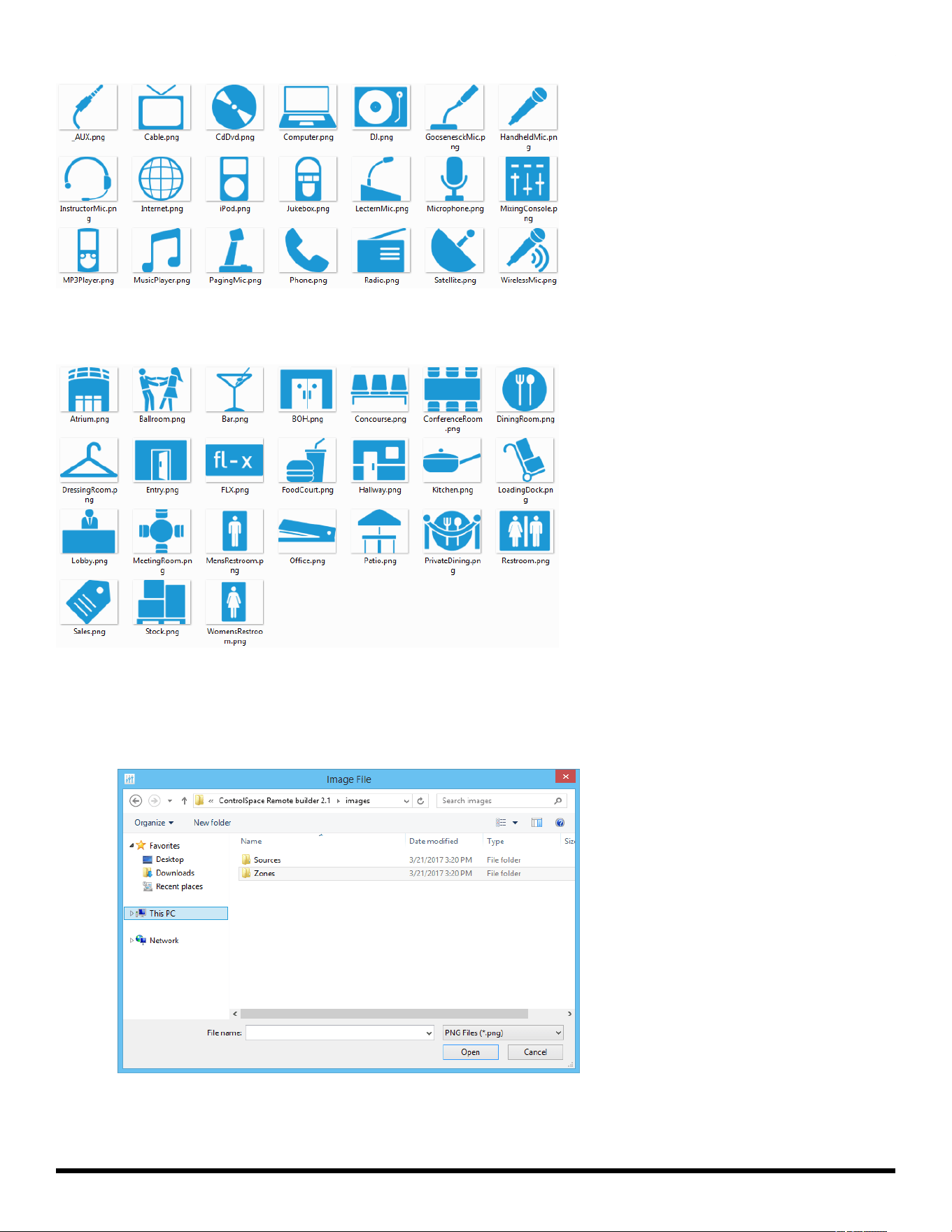
ControlSpace Remote builder software includes an image library of sources and zones that may be used to
create your custom control panel.
- 30 -
ControlSpace
®
Remote Builder 2.3 User's Guide
Source Image Library
Zone Image Library
To place a library image on the canvas,
1. Follow the steps 1-3 above and drag the image icon into the canvas.
2. In the Properties tab, navigate to the directory for the Sources and Zones folders.
Locating Sources and Zones images
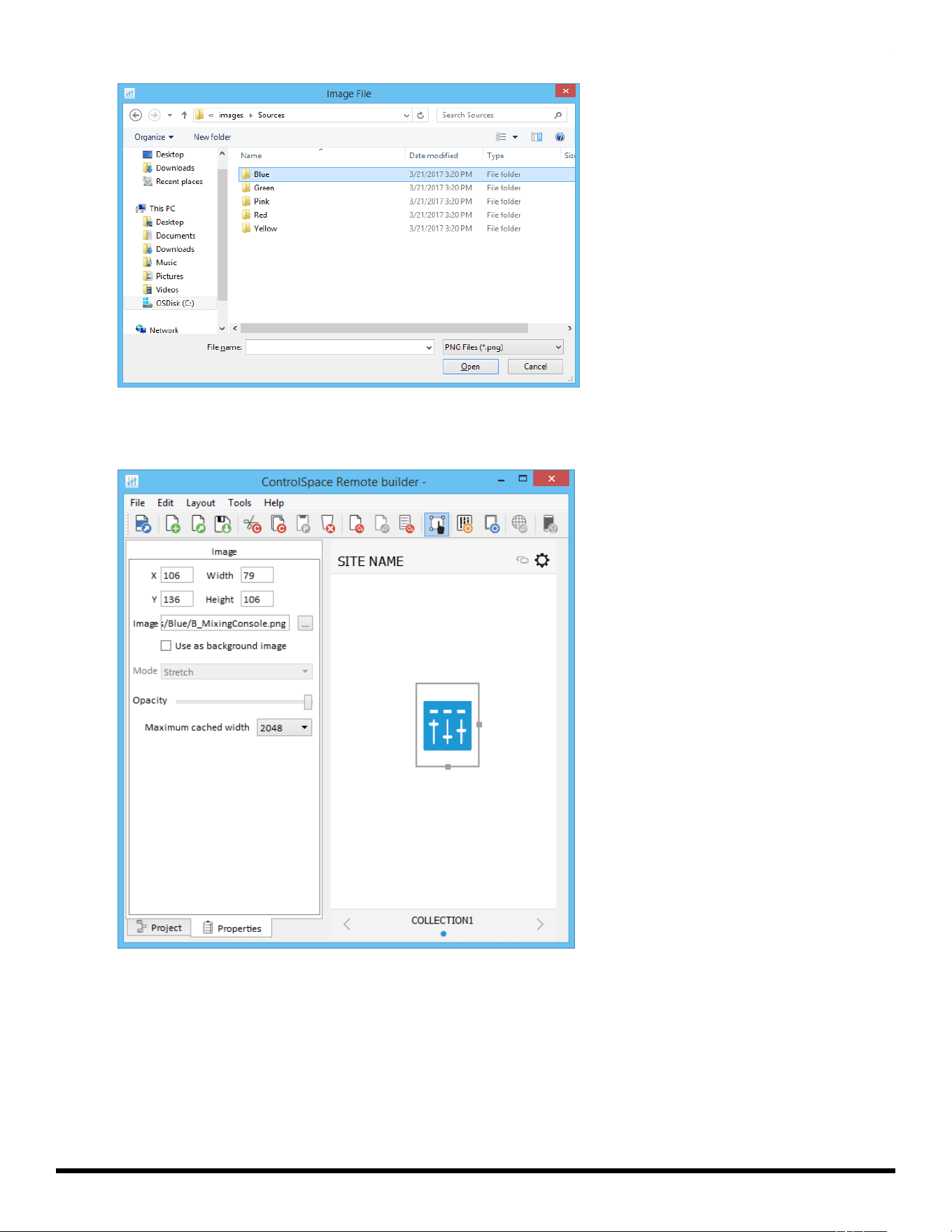
3. Open one of the folders to find the available images. Library images are available in five colors.
- 31 -
ControlSpace
®
Remote Builder 2.3 User's Guide
Choosing colored images
4. Open the folder for the color you want, select an image and click Open. The image will appear on the
canvas.
Selected Blue Image on Canvas
NOTE: Image colors match the Skin accent colors selected in the Canvas Setup properties.
5. Re-size the image by dragging the handles on the right and bottom edges of the image frame.
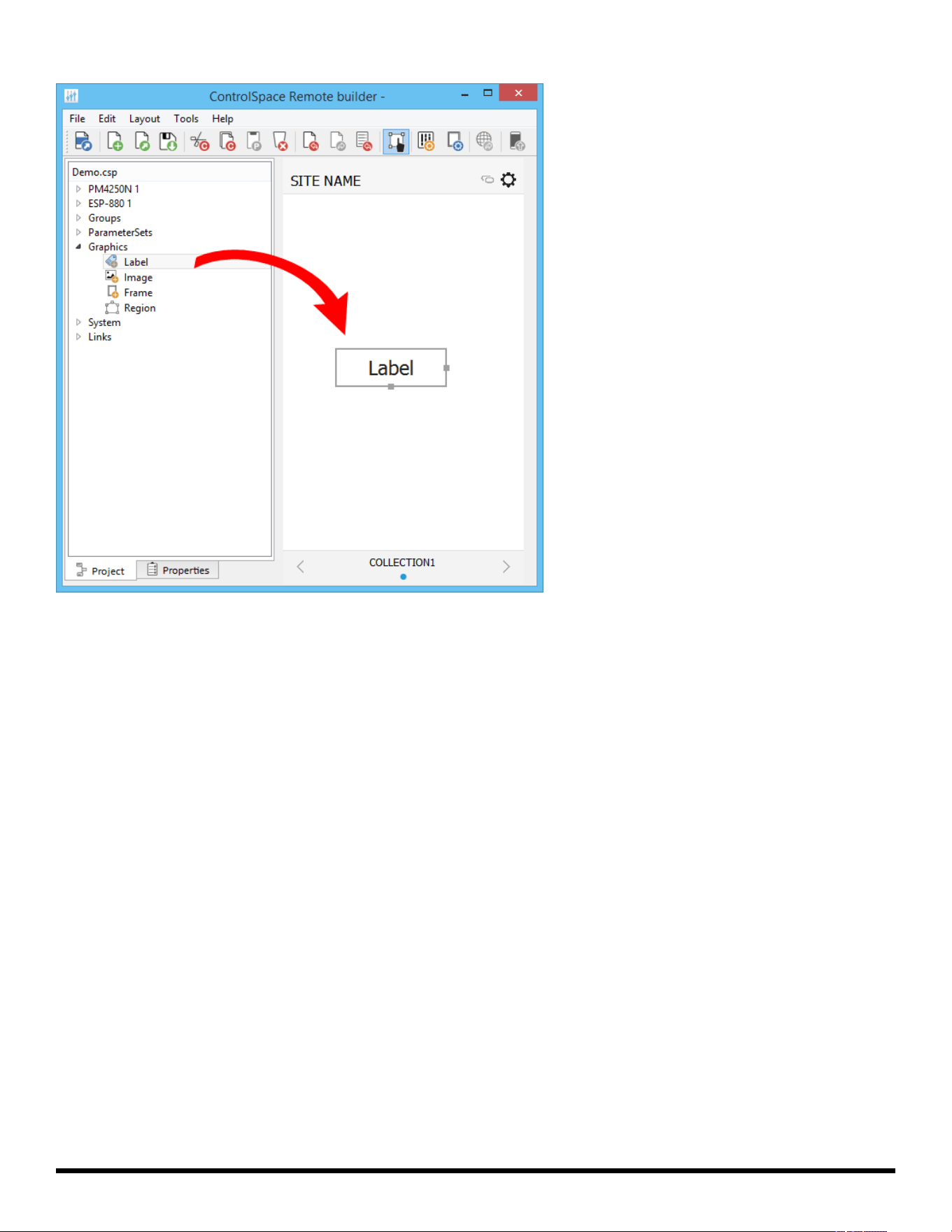
Adding Text Frames &Labels
Using the Label graphic you can place a text field on other graphics creating labels or text strings. Labels
can be re-sized by dragging the handles on the right and bottom edges of the frame.
- 32 -
ControlSpace
®
Remote Builder 2.3 User's Guide
Dragging a Label into the Canvas
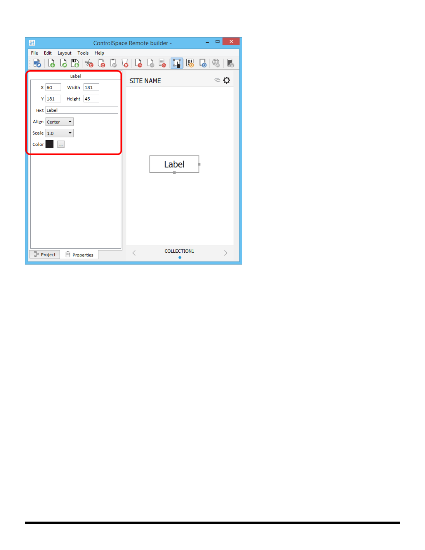
Double-clicking the Label in the canvas or clicking the Properties tab reveals the Label properties.
- 33 -
ControlSpace
®
Remote Builder 2.3 User's Guide
Label Properties
Label Properties are defined as follows:
X/Y – X/Y coordinates of the upper-left corner of the frame.
Width/Height – width and height of the frame.
Text – text field for the label.
Align – positions the text left, right, or center.
Scale – changes the size of the text.
Color – changes the color of the text.
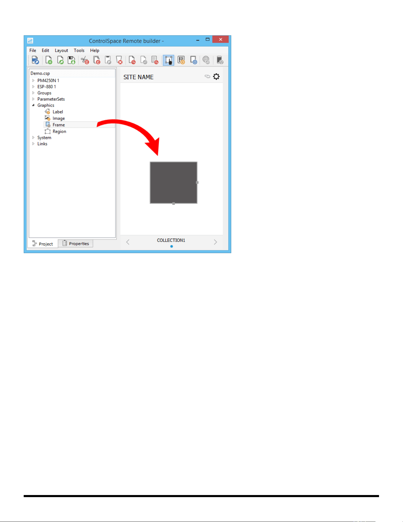
Adding Frames
Using the Frame graphic you can add a rectangular shape to your design. Frames can be re-sized by drag-
ging the handles on the right and bottom edges of the frame.
- 34 -
ControlSpace
®
Remote Builder 2.3 User's Guide
Dragging a Frame into the canvas
Double-clicking the Frame in the canvas or clicking the Properties tab reveals the Frame properties.
- 35 -
ControlSpace
®
Remote Builder 2.3 User's Guide
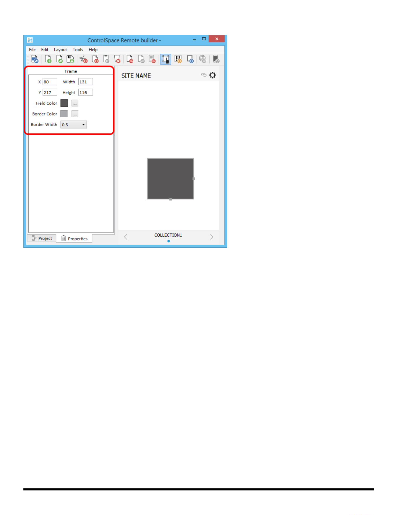
Frame Properties
Frame Properties are defined as follows:
X/Y – X/Y coordinates of the upper-left corner of the frame.
Width/Height – width and height of the frame.
Field Color – changes the fill color.
Border Color – changes the color of the border.
Border Width – changes the line weight of the border.
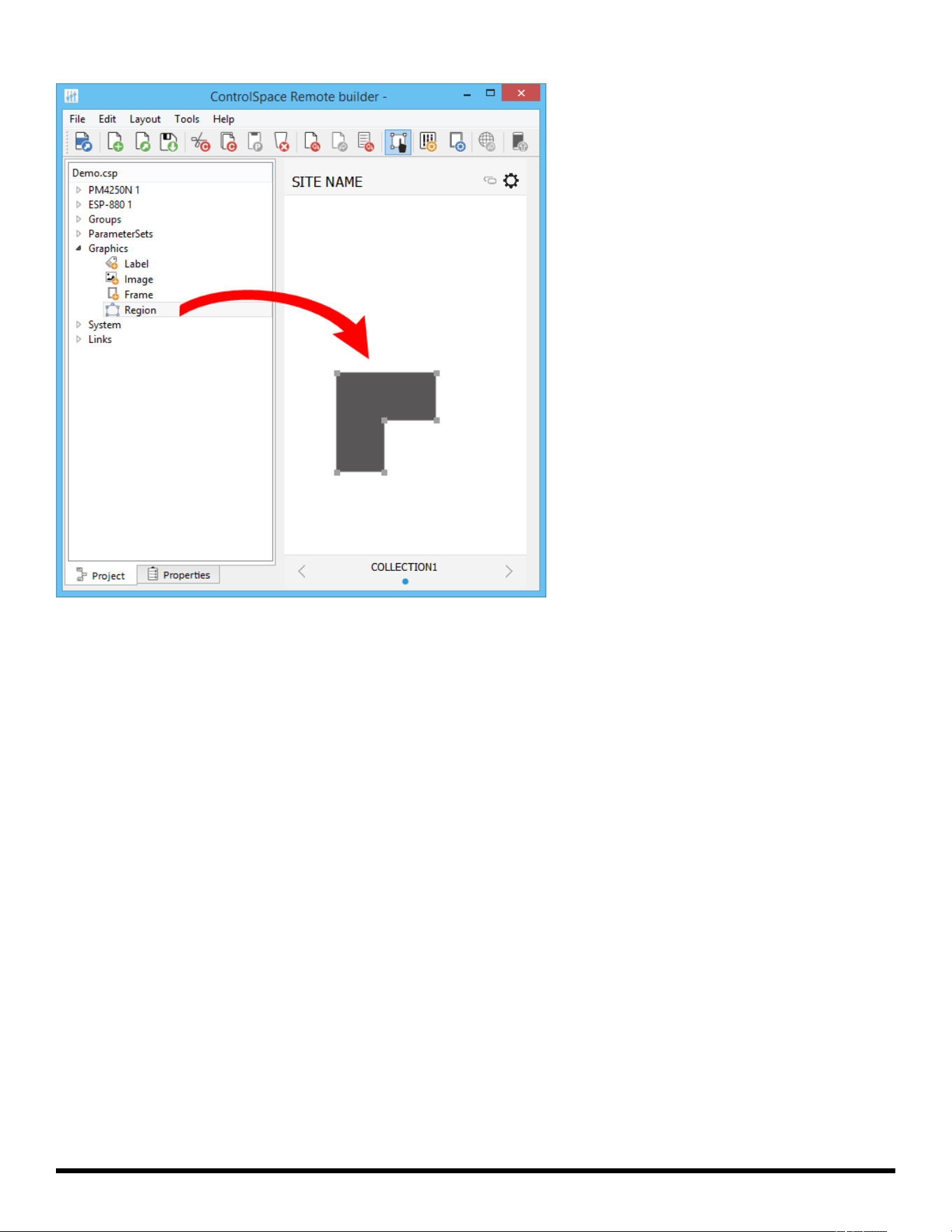
Adding Regions
Using the Region graphic you can add a customizable polygon to the canvas. A Region can be linked to an
existing control panel. Regions can be re-shaped by dragging the handles on the edges of the frame.
- 36 -
ControlSpace
®
Remote Builder 2.3 User's Guide
Dragging a Region into the canvas
Double-clicking the Region in the canvas or clicking the Properties tab reveals the Region properties.
- 37 -
ControlSpace
®
Remote Builder 2.3 User's Guide
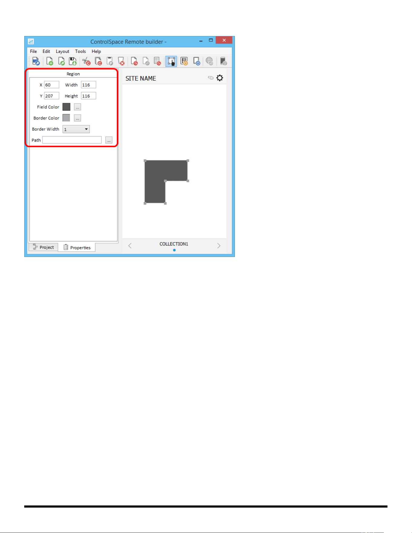
Region Properties
Region Properties are defined as follows:
X/Y – X/Y coordinates of the upper-left corner of the frame.
Width/Height – width and height of the region.
Field Color – changes the fill color.
Border Color – changes the color of the border.
Border Width – changes the line weight of the border.
Path – links the region to an existing control panel.
Creating Custom Controls
Project controls listed in the tree view can be dragged into a custom panel design. The appearance of but-
tons, sliders, and drop lists can be changed using their individual properties.
You can create:
CustomButtons
Custom Sliders
Custom Drop Lists
Custom RCGroups
Custom Parameter Sets
Custom Parameter Set Lists
Custom Links
Custom Setup Button
- 38 -
ControlSpace
®
Remote Builder 2.3 User's Guide
Custom Remote Connection Indicator
Custom Buttons
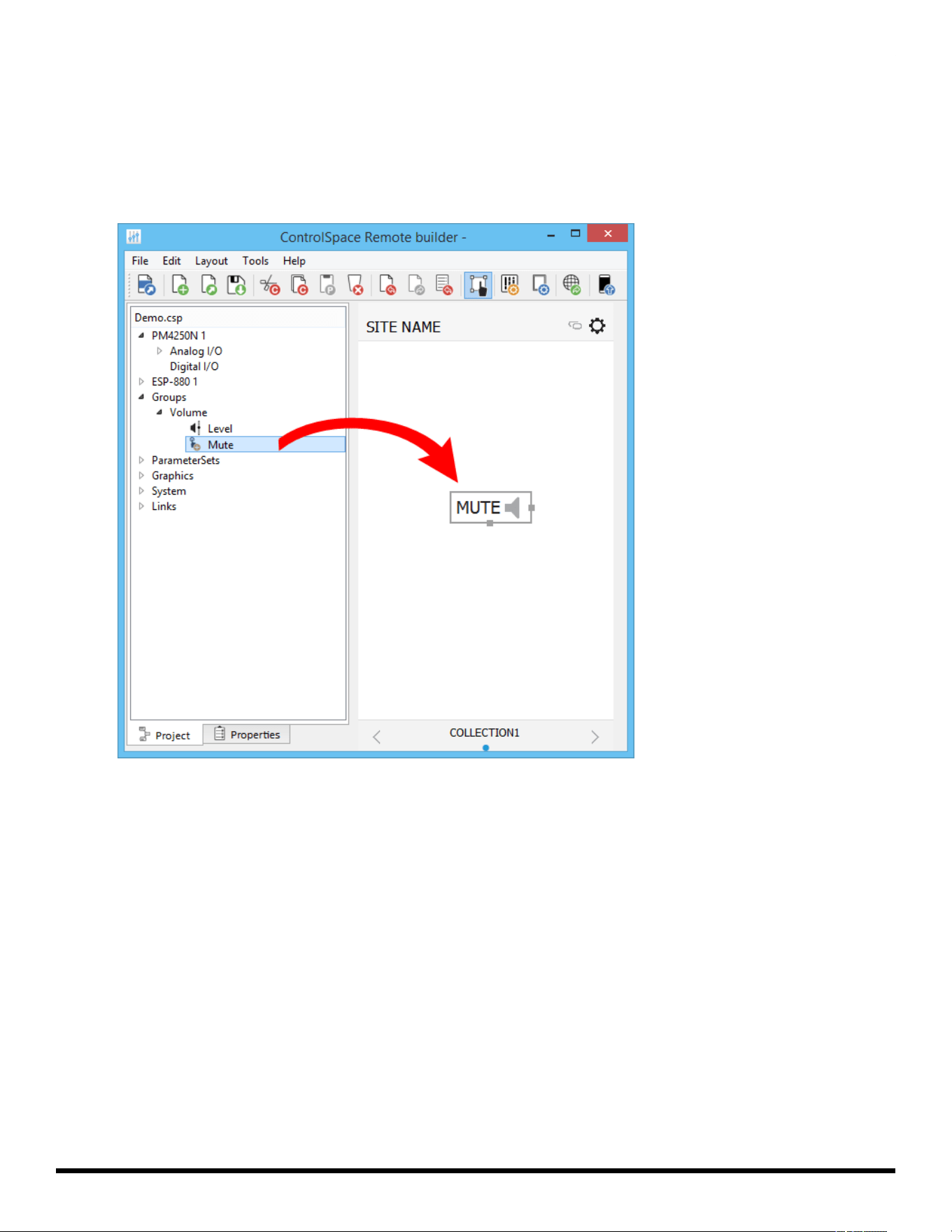
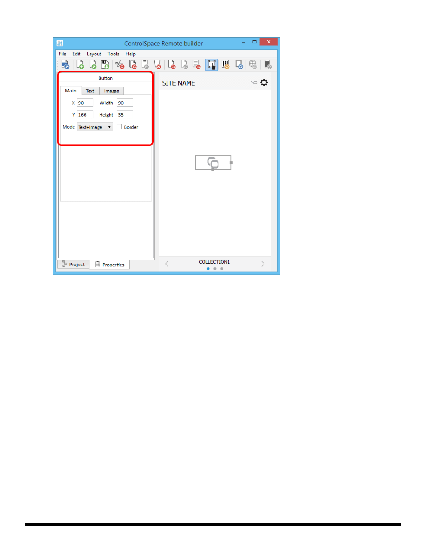
1. From the Project tab, drag a button into the canvas.
2. Using the handles on the right and bottom edges, re-size the button.
Dragging a Button into the Canvas
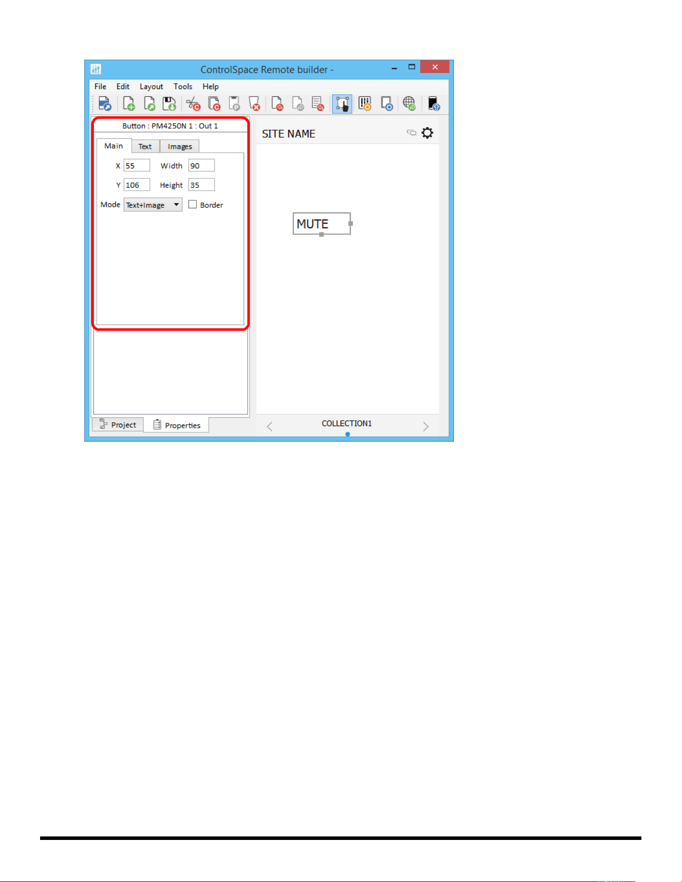
3. To access the button properties, double-click the button or click the Properties tab.
- 39 -
ControlSpace
®
Remote Builder 2.3 User's Guide
Viewing the Mute Button Properties
4. Adjust the properties as desired, using the options available in the tabs:
Main Tab:
X/Y – X/Y coordinates of the upper-left corner of the frame.
Width/Height – width and height of the button.
Mode – selects how the button appears: Text, Image, or Text+Image (both).
Border – when checked, places a border around the button.
Text Tab: (only active in Text and Text+Image modes)
Text – allows text entry for button labels when mute is off or on.
Images Tab: (only active in Image and Text+Image modes)
Image – specifies whether to use the default icon or a custom image.
Off – specifies image when mute is off.
On – specifies image when mute is on.
Custom Sliders
1. From the Project tab, drag a slider into the canvas.
2. Using the handles on the right and bottom edges, re-size the slider.
- 40 -
ControlSpace
®
Remote Builder 2.3 User's Guide
Dragging a Slider into the Canvas
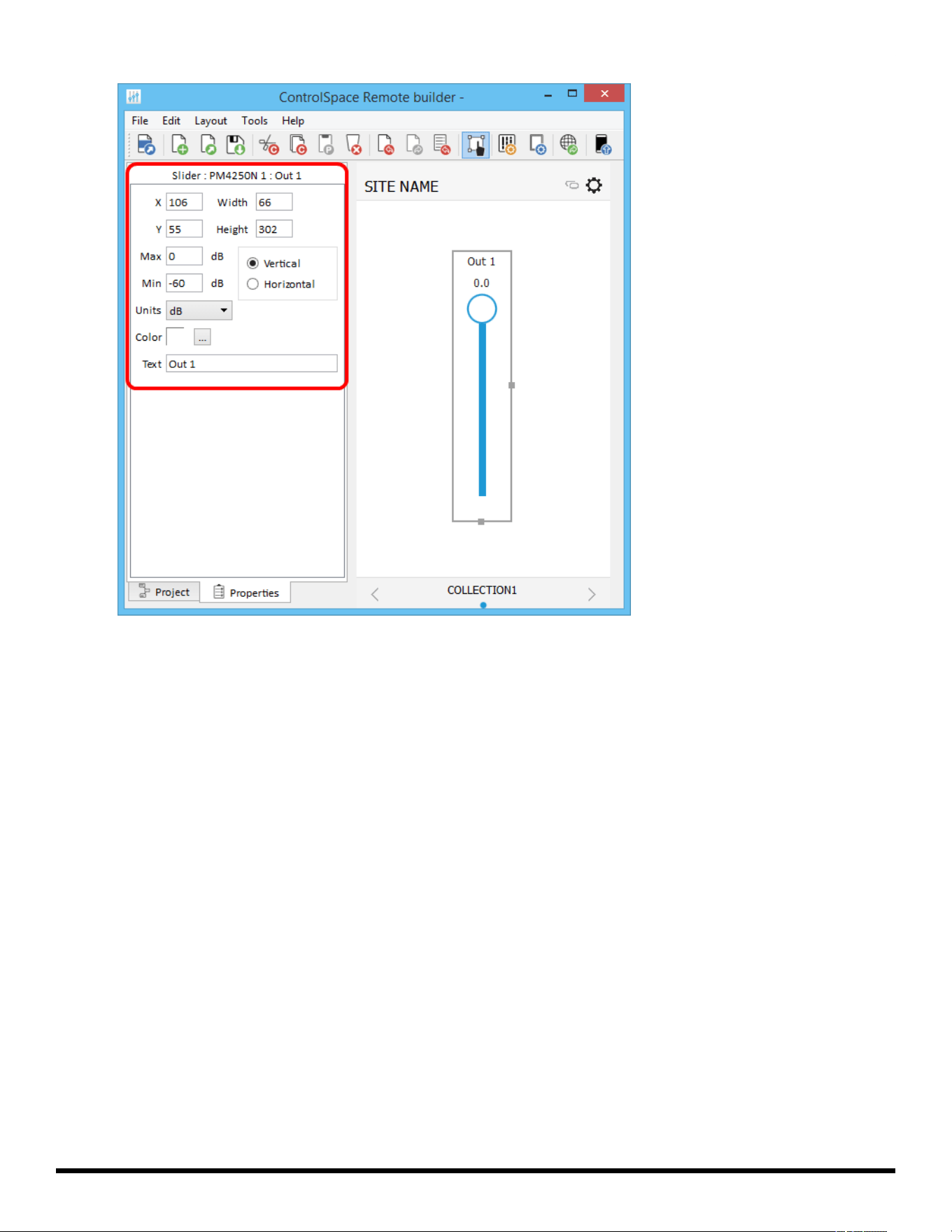
3. To access the slider properties, double-click the slider or click the Properties tab
- 41 -
ControlSpace
®
Remote Builder 2.3 User's Guide
Viewing the Slider Properties
4. Adjust the properties as desired:
X/Y – X/Y coordinates of the upper-left corner of the frame.
Width/Height – width and height of the slider.
Max – selects the maximum value on the slider.
Min – selects the minimum value on the slider.
Vertical/Horizontal – sets the orientation of the slider as vertical or horizontal.
Units – selects dB or Percent.
Color – selects the color of the slider.
Text – allows entry of a label for the slider.
Custom Drop Lists
1. From the Project tab, drag a list into the canvas.
2. Select the items you want in the list and click OK.
- 42 -
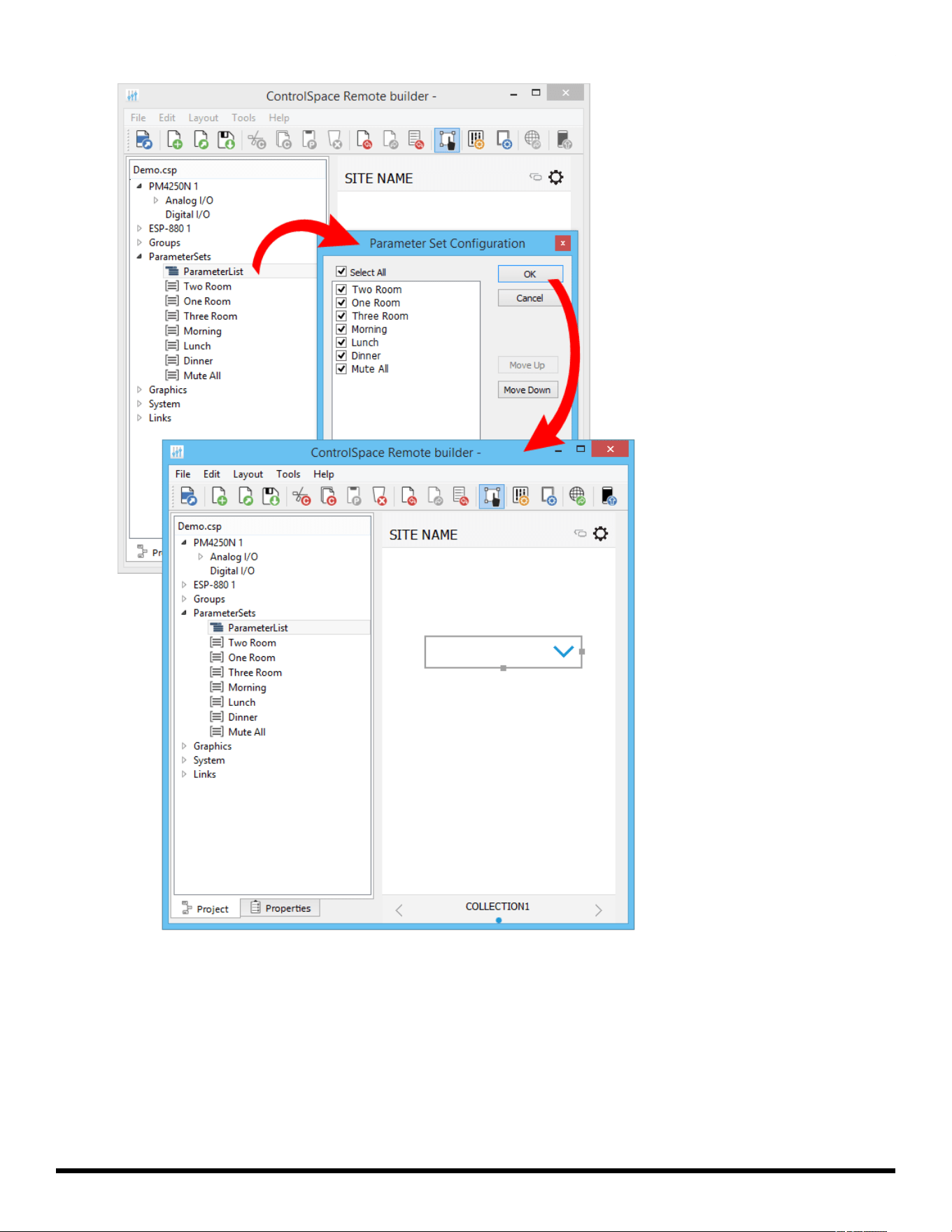
ControlSpace
®
Remote Builder 2.3 User's Guide
Dragging a Drop List into the Canvas
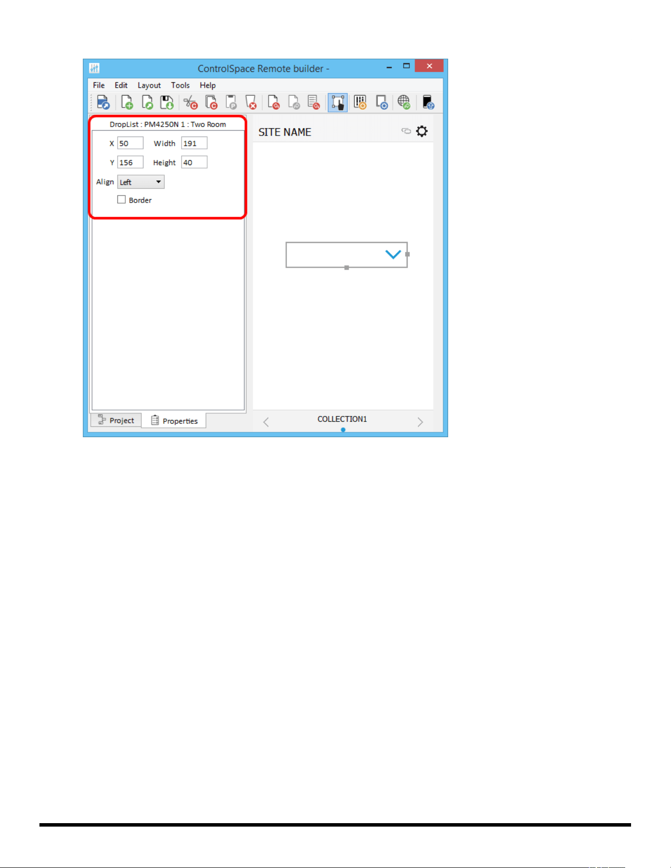
3. Using the handles on the right and bottom edges, re-size the drop list.
4. To access the drop list properties, double-click the list or click the Properties tab.
- 43 -
ControlSpace
®
Remote Builder 2.3 User's Guide
Viewing the Drop List Properties
5. Adjust the properties as desired:
X/Y – X/Y coordinates of the upper-left corner of the frame.
Width/Height – width and height of the slider.
Align – positions the list Left, Center, or Right
Border – when checked, places a border around the button.
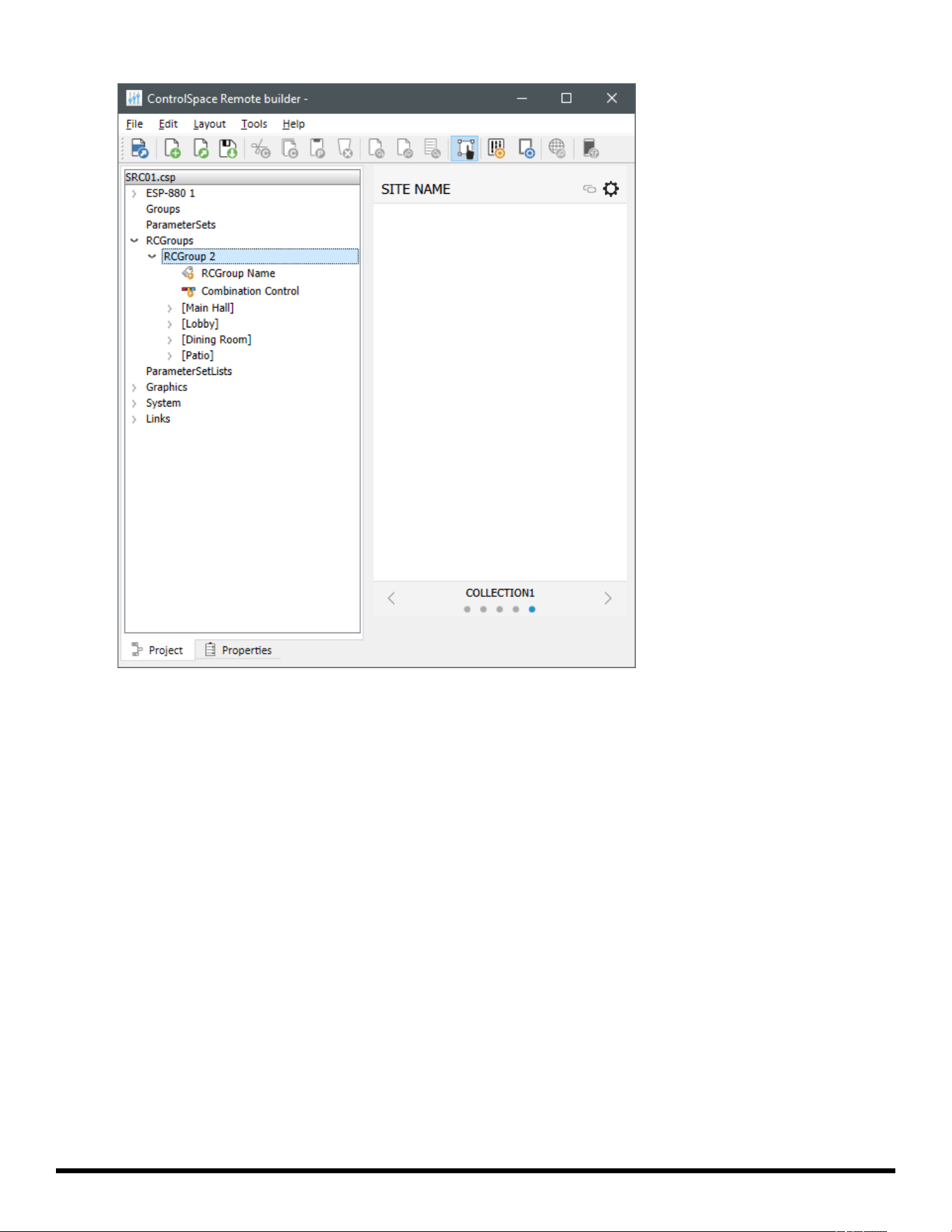
Custom RCGroups
Room Combination Actions
To create a separate panel for your room combining controls:
1. In the Project tab, expand the RCGroups item, and then expand the RCGroup with the desired rooms.
- 44 -
ControlSpace
®
Remote Builder 2.3 User's Guide
2. Optional:Place an image of the room layout on the canvas. You can then place room selection controls
over the image to create a more visual reference for them. See Creating Custom Layouts >Importing
Backgrounds to learn how to do this.
3. Click and drag the Combination Control for the RCGroup onto the canvas. This is the selector for each
room combination.
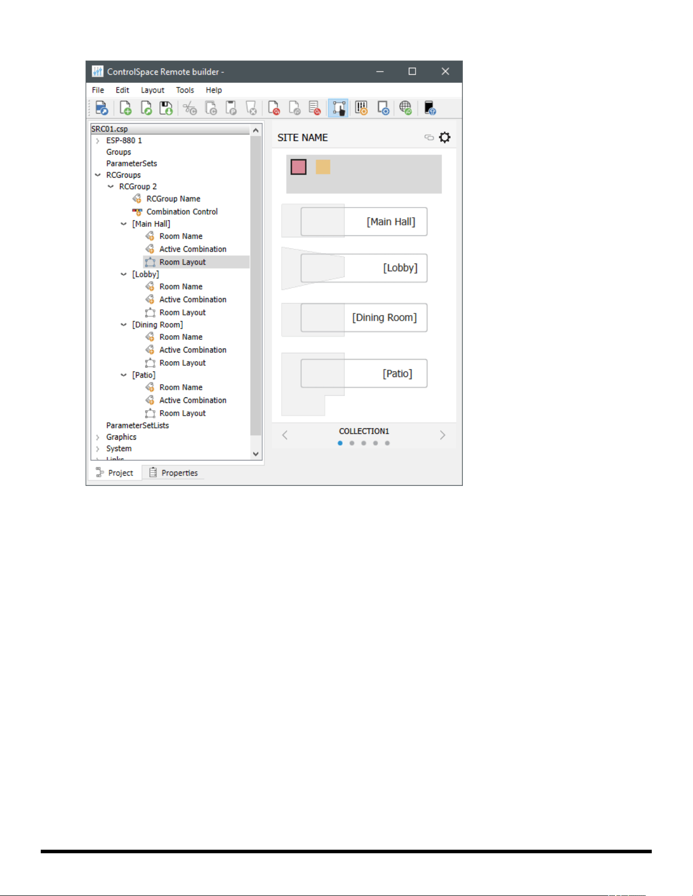
4. Click and drag the desired control(s) for each room you created in Steps 1–2 onto the canvas.
- 45 -
ControlSpace
®
Remote Builder 2.3 User's Guide
Room Name – a label that displays the name of the room. If you are using a room selection control
without an image of the room layout, we recommend placing this over the room selection control.
Active Combination – a field that displays the names of the other rooms that are currently com-
bined with this room.
Room Layout (Selector) – a selector that adds or removes the room to or from the selected room
combination. The selector is a polygon that you can adjust so it represents the physical layout of
the room. Click and drag a handle on the edge of the layout to move it.
5. To access the properties of an item in any of the panels, double-click the item or click the Properties
tab. Adjust the properties as desired.
RCGroup items have the following properties:
RCGroup Name – This item is a label with its text automatically set to the name of the room (see
Creating Custom Layouts >Adding Text Frames &Labels to learn more). If you are using a room
selection control without an image of the room layout, we recommend placing this over the room
selection control.
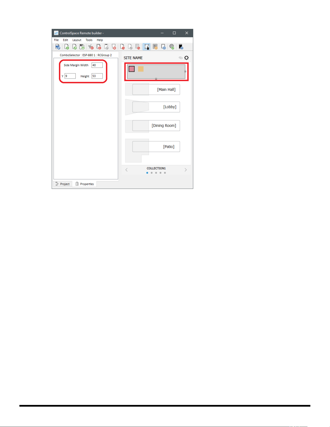
Combination Control:
Y – the Y coordinate of the upper-left corner of the selector frame.
Height – the height of the selector frame, including the space for a scroll bar, when needed.
Side Margin Width – the width of the margin on either side of the selector frame. Change this
setting to adjust the width of the control (which is automatically centered on the canvas).
- 46 -
ControlSpace
®
Remote Builder 2.3 User's Guide
Room Name – the properties are identical to those of a label (see Creating Custom Layouts
>Adding Text Frames &Labels).
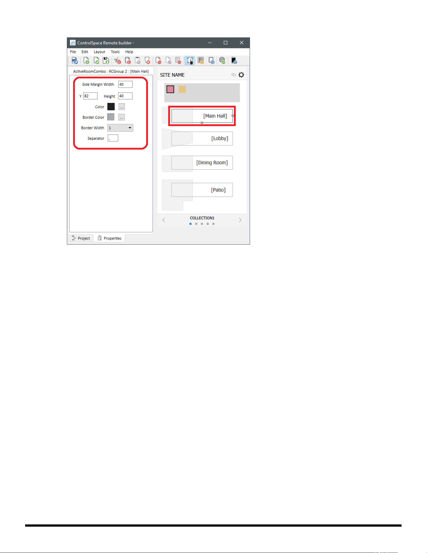
Active Combination: This item is useful when placed on a panel representing a single room (see
Room Combination Audio Controls below to learn more).
Y – the Y coordinate of the upper-left corner of the frame.
Height – the height of the selector frame, including the space for a scroll bar, when needed.
Side Margin Width – the width of the margin on either side of the selector frame. Change this
setting to adjust the width of the control (which is automatically centered on the canvas).
Color – the color of the text inside of the frame.
Border Color – the color of the border of the frame.
Border Width – the width of the border of the frame.
Separator – the character(s) that separate the combined room names shown in the frame.
- 47 -
ControlSpace
®
Remote Builder 2.3 User's Guide
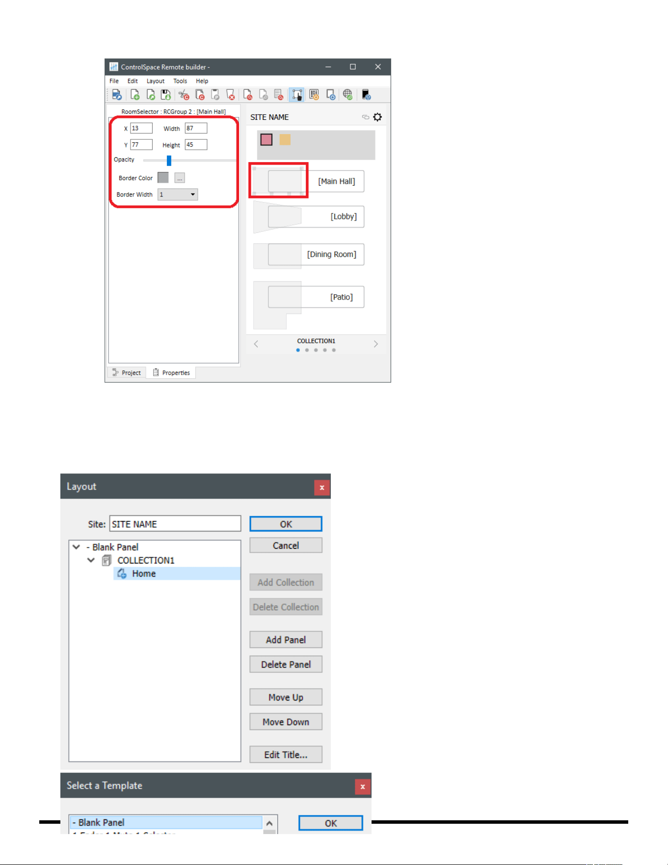
Room Layout (Selector):
X/Y – X/Y coordinates of the upper-left corner of the region.
Width/Height – width and height of the region.
Opacity – determines the transparency of the region.
Border Color – the color of the border of the region.
Border Width – the width of the border of the region.
- 48 -
ControlSpace
®
Remote Builder 2.3 User's Guide
Room Combination Audio Controls
To create an additional panel for each room you want to add:
- 49 -
ControlSpace
®
Remote Builder 2.3 User's Guide
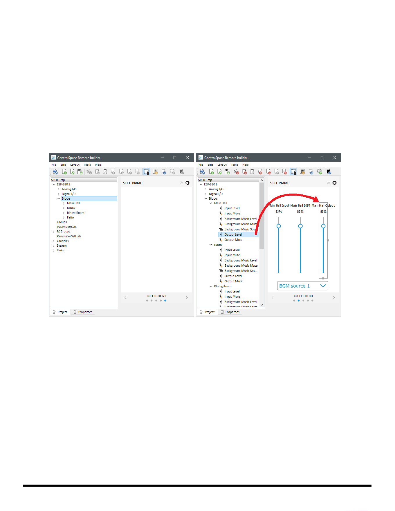
1. Click the Layout icon in the toolbar, or click Tools > Layout.
2. In the Layout window, select the desired collection, and then click Add Panel.
3. In the Select a Template window, select - BlankPanel, and then click OK.
4. In the Layout window, click OK. Below the canvas, there should be an additional dot in the Status bar to
indicate a new panel.
5. In the Project tab, expand the node(s) containing the desired audio controls (controls for standard
room combiner blocks [StRC] and conference room router blocks [CRR]are under the Blocks node of
a device).
6. Click and drag the desired audio control(s) for the room(s) onto the canvas.
7. Recommended: Place the Active Combination item of a room on its corresponding panel. See Room
Combination Actions above to learn about this.
The audio controls for each block are described elsewhere in this help topic:Custom Buttons, Custom
Sliders, Custom Drop Lists, Custom Parameter Sets, Custom Parameter Set Lists, Custom Links, Custom
Setup Button, or Custom Remote Connection Indicator.
Custom Parameter Sets
1. From the Project tab, drag a Parameter Set into the canvas.
- 50 -
ControlSpace
®
Remote Builder 2.3 User's Guide
Dragging a Parameter Set into the Canvas
2. Using the handles on the right and bottom edges, re-size the button.
3. To access the properties, double-click the button or click the Properties tab.
- 51 -

ControlSpace
®
Remote Builder 2.3 User's Guide
Viewing the Parameter Set Button Properties
4. Adjust the properties as desired:
X/Y – X/Y coordinates of the upper-left corner of the frame.
Width/Height – width and height of the button.
Mode – selects how the button appears: text, or text+image.
Border – when checked, places a border around the button.
Text – in Text Mode, allows text entry for a button label.
On/Off – in Image Mode, allows an image selection for both on/off states of the button
Custom Parameter Set Lists
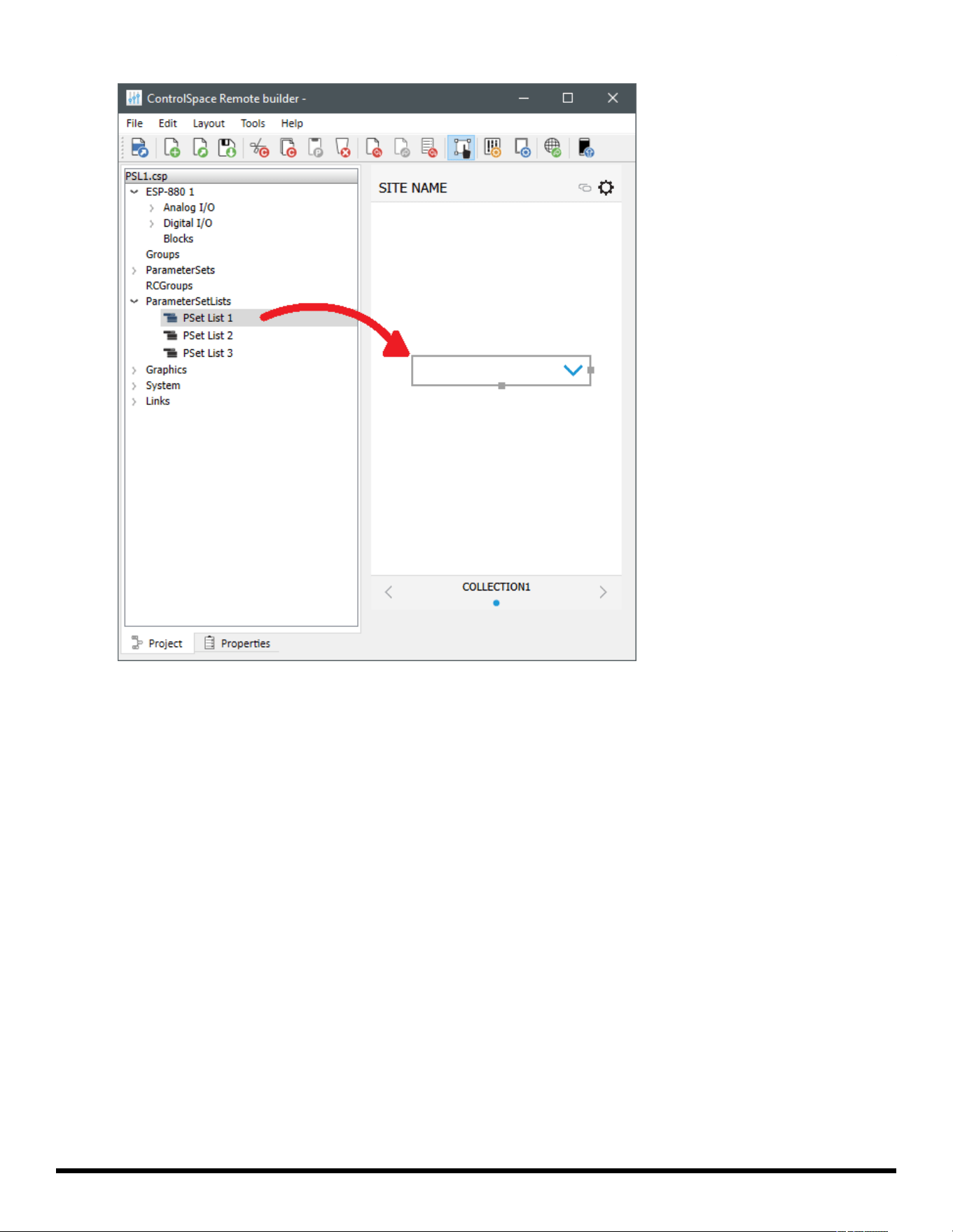
1. From the Project tab, drag a Parameter Set List into the canvas.
- 52 -
ControlSpace
®
Remote Builder 2.3 User's Guide
Dragging a Parameter Set List into the Canvas
2. Using the handles on the right and bottom edges, re-size the button.
3. To access the properties, double-click the button or click the Properties tab.
- 53 -
ControlSpace
®
Remote Builder 2.3 User's Guide
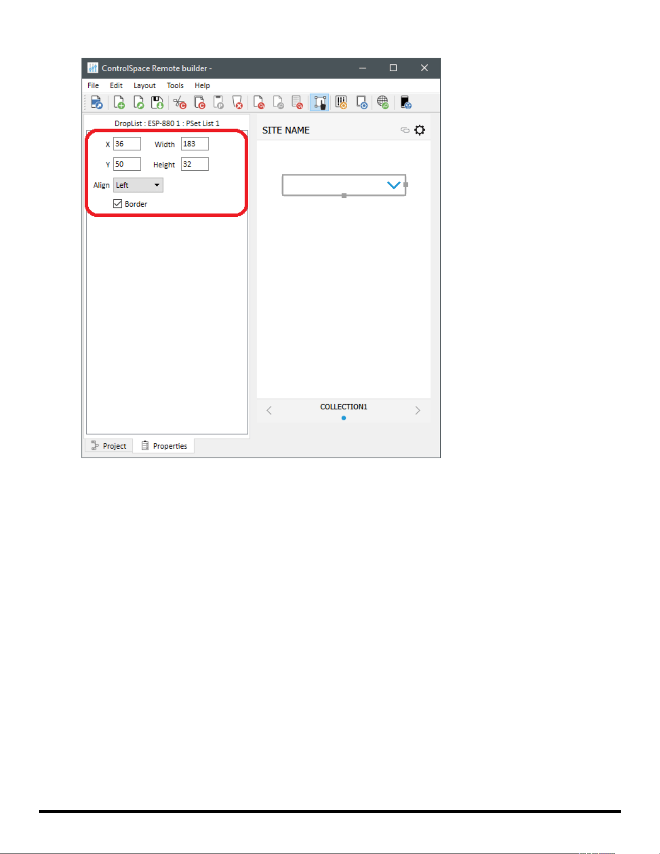
Viewing the Parameter Set List Button Properties
4. Adjust the properties as desired:
X/Y – X/Y coordinates of the upper-left corner of the frame.
Width/Height – width and height of the button.
Align – selects the horizontal alignment of the text in the button.
Border – when checked, places a border around the button.
Custom Links
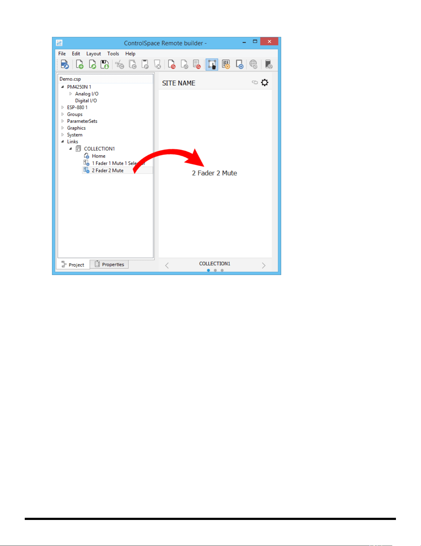
1. From the Project tab, drag a control panel from Links into the canvas.
- 54 -
ControlSpace
®
Remote Builder 2.3 User's Guide
Dragging a Link into the Canvas
2. Using the handles on the right and bottom edges, re-size the button.
3. To access the properties, double-click the button or click the Properties tab.
- 55 -
ControlSpace
®
Remote Builder 2.3 User's Guide
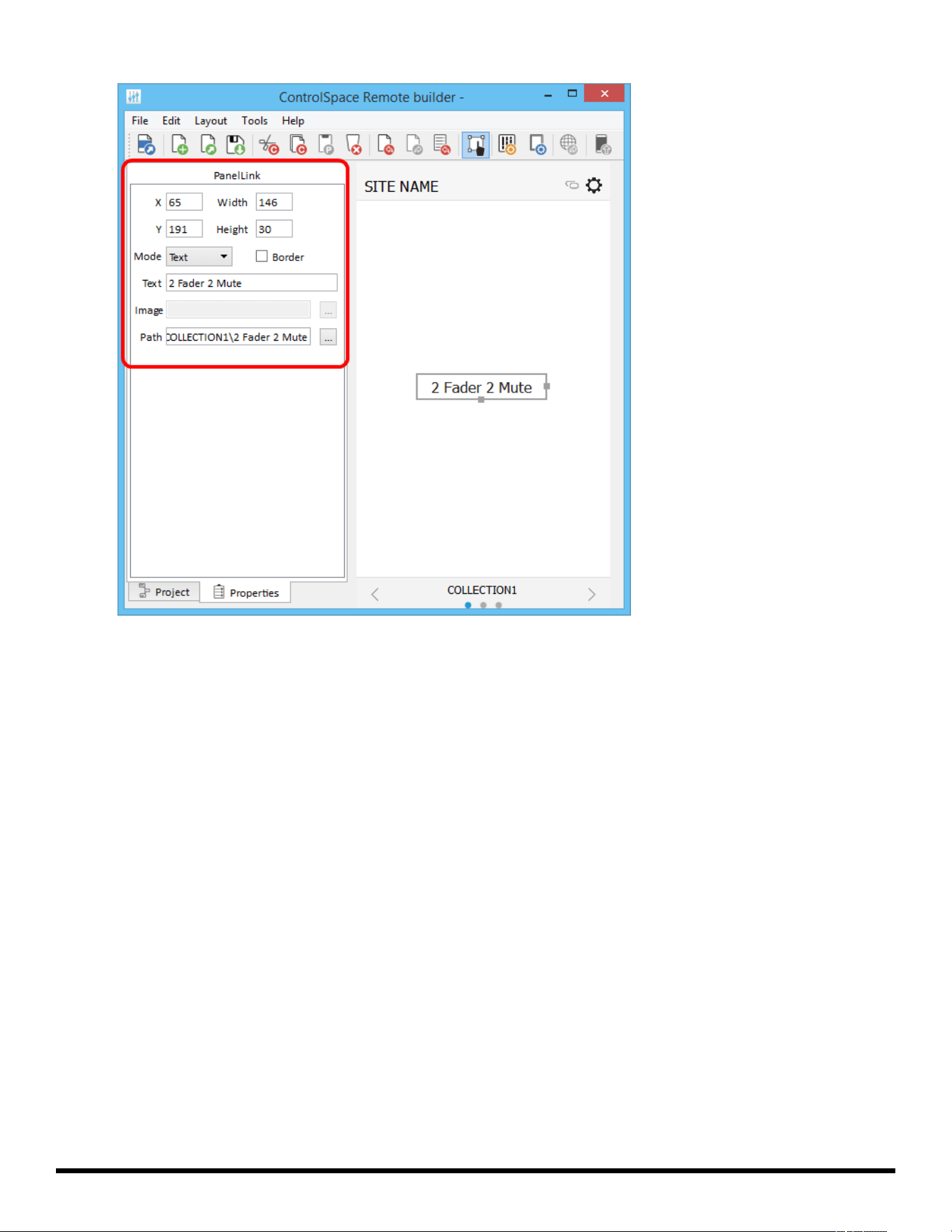
Viewing the Panel Link Properties
4. Adjust the properties as desired:
X/Y – X/Y coordinates of the upper-left corner of the frame.
Width/Height – width and height of the button.
Mode – selects how the button appears: text or image.
Border – when checked, places a border around the button.
Text – in Text Mode, allows text entry for a button label.
Image – in Image Mode, allows selection of an image to use on the button.
Path – links the button to an existing control panel.
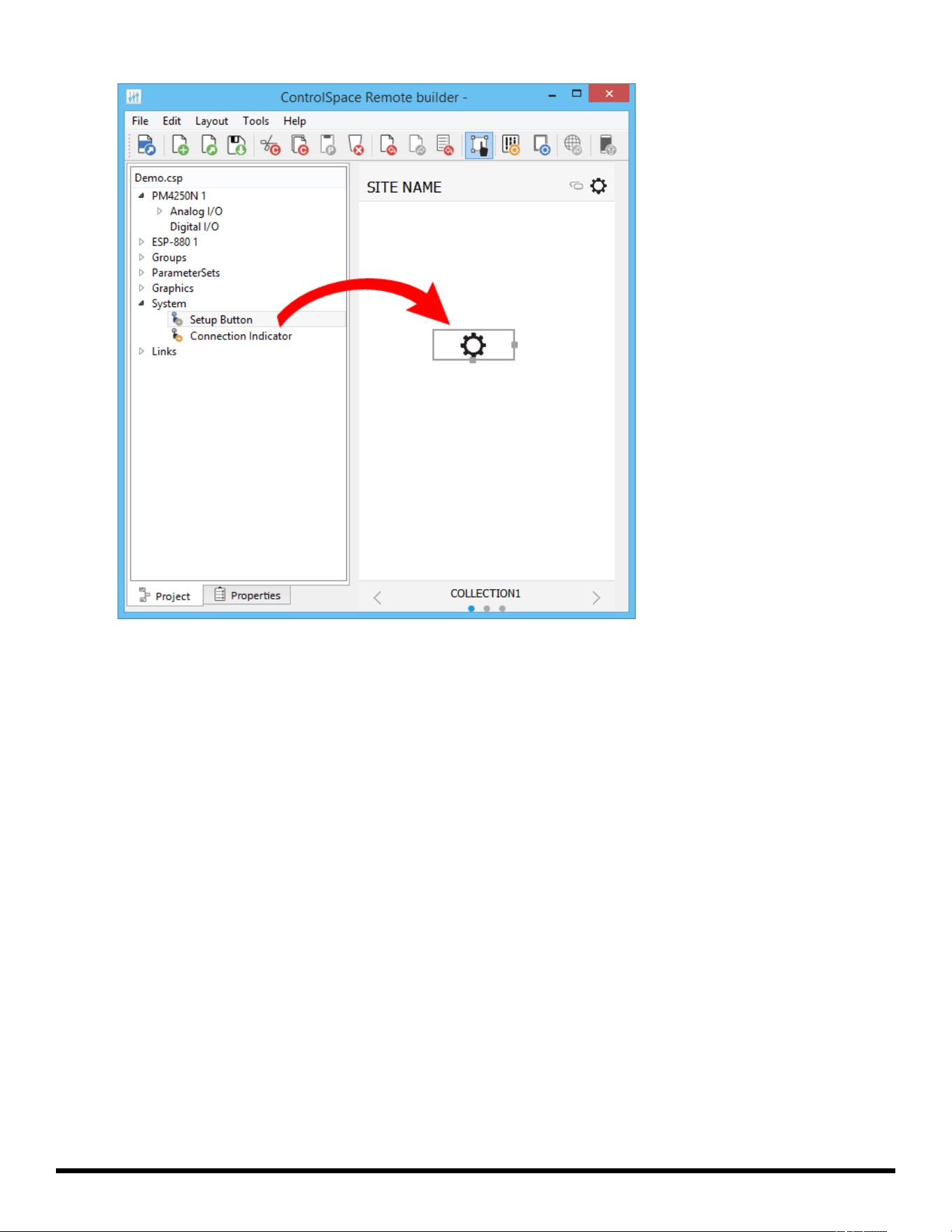
Custom Setup Button
1. From the Project tab, drag a setup button from System into the canvas.
- 56 -
ControlSpace
®
Remote Builder 2.3 User's Guide
Dragging a Setup Button into the Canvas
2. Using the handles on the right and bottom edges, re-size the button.
3. To access the properties, double-click the button or click the Properties tab.
- 57 -
ControlSpace
®
Remote Builder 2.3 User's Guide
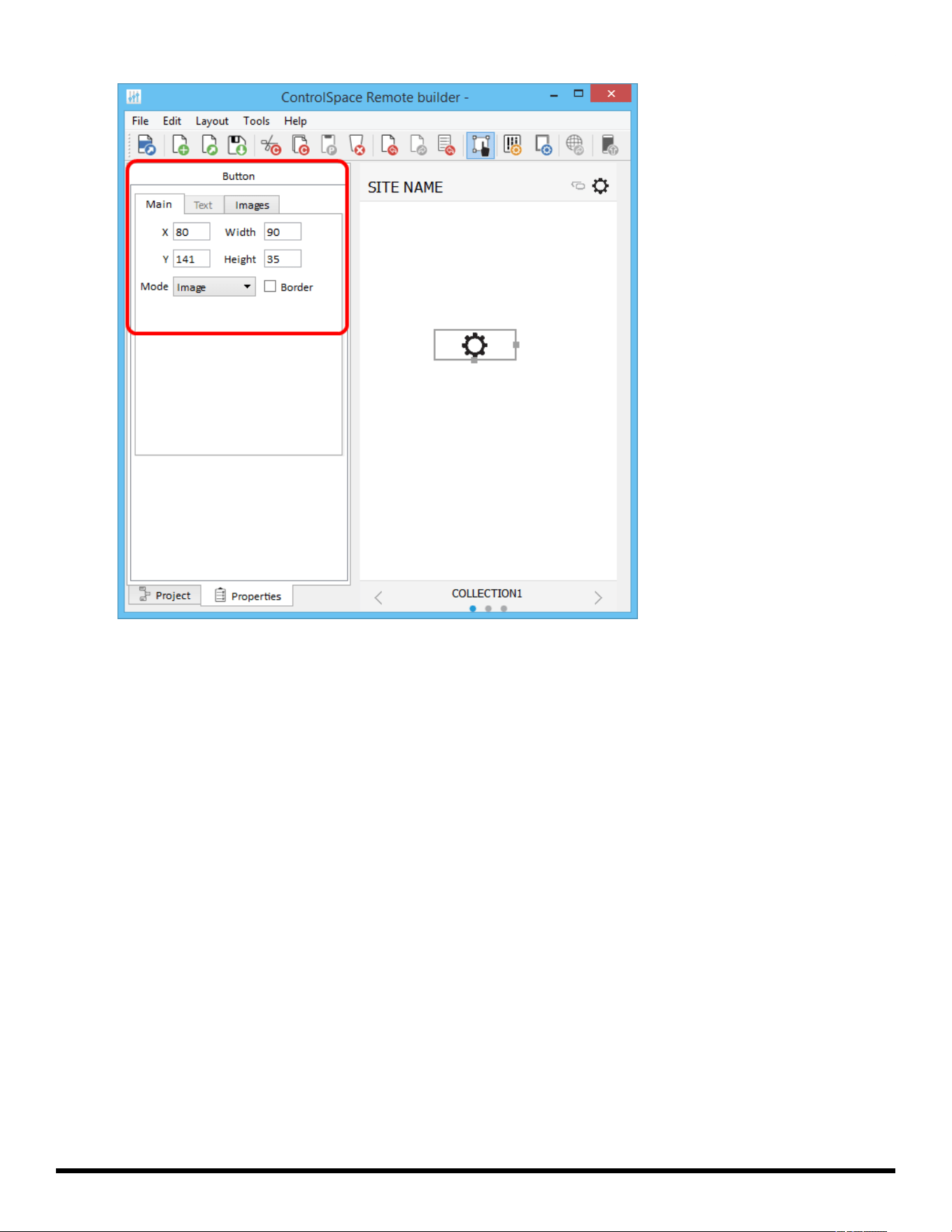
Viewing the Button Properties
4. Adjust the properties as desired, using the options available in the tabs:
Main Tab:
X/Y – X/Y coordinates of the upper-left corner of the frame.
Width/Height – width and height of the button.
Mode – selects how the button appears: Text, Image, or Text+Image (both).
Border – when checked, places a border around the button.
Text Tab: (only active in Text and Text+Image modes)
Text – allows text entry for a button label.
Images Tab: (only active in Image and Text+Image modes)
Image – specifies whether to use the default icon or a custom image. If you choose Custom,
browse to your desired image using the field that appears below the drop-down menu.
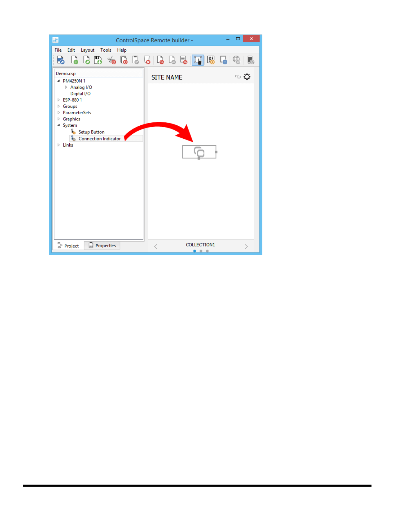
Custom Remote Connection Indicator
1. From the Project tab, drag a connection indicator button from System into the canvas.
- 58 -
ControlSpace
®
Remote Builder 2.3 User's Guide
Dragging a Connection Indicator Button into the Canvas
2. Using the handles on the right and bottom edges, re-size the button.
3. To access the properties, double-click the button or click the Properties tab.
- 59 -
ControlSpace
®
Remote Builder 2.3 User's Guide
Viewing the Button Properties
4. Adjust the properties as desired, using the options available in the tabs:
Main Tab:
X/Y – X/Y coordinates of the upper-left corner of the frame.
Width/Height – width and height of the button.
Mode – selects how the button appears: Text, Image, or Text+Image (both).
Border – when checked, places a border around the button.
Text Tab: (only active in Text and Text+Image modes)
Text – allows text entry for button labels when the connection is off, on, or partial.
Images Tab: (only active in Image and Text+Image modes)
Image – specifies whether to use the default icon or a custom image.
Off – specifies image when the remote connection is off.
On – specifies image when the remote connection is on.
Partial – specifies image when the remote connection is partially active.
- 60 -